Quantcast
Channel: Modern Printmakers
Viewing all 255 articles
Browse latest View live

John Hall Thorpe & Bemrose and Sons

$
0
0


As some of you will know, John Hall Thorpe training was in commercial work in Sydney where he was on the staff of two newspapers before he moved to Britain in  He had already made a few etching whilst in Australia and did not exhibit any colour woodcuts until the end of the first war. But when he did, these prints were important in the revival of colour woodcut in the 1920s. As you may also know, Hall Thorpe never printed his own work and acknowledged the printing was done under his supervision.  This meant he was unable to exhibit with the Graver Printers though he gained by having much larger editions to sell. If he went to a commercial printer (and I think be did) he was also limited by the numbers and subtlety of the colours he used. But if you look carefully at his prints, what stands out is how successful his economy of means was.


William Bemrose (or Bemrose and Sons as it became) certainly worked with Hall Thorpe on prints like Summer (top) which was published in 1929. Bemrose set up in Derby as a maker of railway timetables in 1826 and naturally worked with the Midland Railway whose main base was at Derby Station (destroyed by British Rail). The fine engraving below of the station was made by them in 1840 and you will be pleased to know the memorable clock tower to the left remains unmolested 180 years later. Features like the tower were typical of the Midland's serious attitude to public architecture. John Ruskin was appalled by their plans to drive the main line through from Matlock to Chinley but no one seeing the grandeur of the remote viaduct over the Derwent at Monsall Dale could fail to be impressed.


The firm did everything. This poster for the Midland's excursion to Newcastle races from Sheffield is typical though not the most amusing. Readers who are also railway buffs will notice that by the seventies, the Midland were a market leader and had done away with 2nd class, much to the consternation of other operators. The Midland took a modern, integrated approach to rail travel and whether it was commercial vigour, engineering expertise or style, for a time they were in the vanguard. George Stephenson did work for them, but they also understood the appeal of stylishness and how far everything from stations and publicity to refreshments could promote the railways as a pleasurable and sophisticated form of travel. From Leicester London Road to Nottingham Midland, surviving stations are confident and original and some small stations like Matlock Bath in Derbyshire and Collingham, Nottinghamshire, were remarkable if not sublime. Everyone played their part, including businesses with expertise like Bemrose.


Bemrose's son, William, became interested in applied art and wrote a book on wood-carving but the firm evidently had the ability to produce fine prints by 1840.  As you see from the 1902 advertisement  (second from top) colour block had become prominent in the specialist work they undertook. You will also note by then they had premises at Snow Hill in east central London. By the 1930s, they were printing off everything from colour railway posters to brochures for L.M.S. With classic overkill, Matlock was promoted not only as our own Switzerland but as a metropolis of hydropathy. (Matlock Bath station was designed to look like a chalet - wood was another feature of Midland designs). 


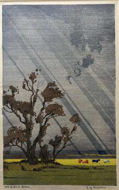
Readers will know from the previous post that Bemrose worked with Arthur Rigden Read on Valencia. But notice the similarity between the block capitals used in Hall Thorpe's Summer and S.G. Boxsius'Evening afterglow (below). I suspect this masterly woodcut from about 1936 was printed by Bemrose. Certainly if Boxsius had printed it himself, he would have signed it in pencil. (I know it isn't signed because I own it). What Boxsius, Read and Hall Thorpe all had in common is knowledge of the print trade. I cannot be sure that Bemrose printed any of Hall Thorpe's other woodcuts, but someone had to and, as you see from the standard of all the prints and posters here, Bemrose knew what they were about.


But I need to add a footnote about letterpress of the kind used by Bemrose in the C19th. In 1916, Robert Gibbings made the initial proofs for his first colour woodcut, Retreat from Serbia, on the letterpress kept at his father's rectory in County Cork. (See the post about Gibbings). Both Hall Thorpe and Gibbings had studios in Fulham in London towards the end of the war. Gibbings installed an Albion press at his and I believe Hall Thorpe's attitude to making prints owes something at least to Gibbing's resourcefulness. Gibbings showed it was possible make colour woodcuts good enough for the V&A to buy them without using the laborious Japanese method. The V&A may never have paid for any of Hall Thorpe's prints but he made sure they had some all the same.


Land of Hope & Glory: the colour woodcuts of E.A. Hope

$
0
0


The only reason the colour woodcuts of E.A. Hope have not been featured on Modern Printmakers before is because so few can be seen anywhere - until now, that is. I have a record of eleven colour woodcuts and six of them are here, enough to give readers a good idea of what she could do.

She was born in the Sydney suburb of Ryde in 1870 but the family's true home was Hopetoun House, an extensive Palladian mansion at South Queensferry on the Firth of Forth. Her father was  the Hon. Louis Hope, son of the Earl of Hopetoun who was serving as Governor of Australia. Hope moved to London where her mother lived in Chelsea. Hope herself lived in Fulham is an area that remains full of artists' studios. (Robert Gibbings was in the next street and John Hall Thorpe not far away either). She studied at the Slade but this doesn't make her  Stanley Spencer or Gwen John. She may only have been there for a term or two. She could have afforded more but that isn't the point. At the Slade she must have got to know Elsie Garrett Rice and Lucy Gill who went on to make colour woodcuts after the first war. Hope and Garrett Rice both made colour woodcuts at Boston in Lincolnshire (below) and one reader is not only lucky enough to own both  prints, Boston church by the river (1929) by Garrett Rice is inscribed to Gill and her brother, Edwin. (To be included in a second post).


This group of friends and her contact with Australia help to make Hope worth looking at. Like so many. she switched from etching to colour woodcut and, as with so many, the reason can be found in the work that Frank Brangwyn and Yoshijiro Urushibara did together. (Hope had Brangwyn design a bookplate for her as Edith Hope.) In 1915, Walter Sparrow-Shaw brought out A book of bridges illustrated with what appeared to be woodcuts by Brangwyn. Urushibara took the least exclamatory of these and with an inwardness and skill that was beyond his collaborator, transformed the small image into the magnificent Ruins of a Roman bridge of 1919. Along with Brangwyn's series of grandiloquent windmills, this bridge set a trend like no other. It meant that no colour woodcut artist seeing a nice old bridge could resist having a go and Hope was more successful than most. Trotton Bridge (1925) easily outperforms Phillip Needell's Pont d'Avignon (1925) and Eric Hesketh Hubbard's canal bridge.


I am  pretty certain this print gave S.G. Boxsius the idea for his early colour woodcut, Houghton Bridge, Sussex. I say this partly because around this time the Austrailian artist, Ethel Spowers, came over from Paris and made two colour woodcuts of bridges, including her 1926 print The Green Bridge showing the Kissing Bridge at Walberswick, quite obviously the basis for Boxsius' masterly At Walberswick from five years later. The people who try to write about the colour linocuts that Spowers made after studying with Claude Flight three years later, have missed all this and consequently the relationships between the artists making colour woodcut and colour linocut (and some times it was the dame people) have not been properly researched. (You read that here first.) Only look at the differences between The red tower (top) and the two prints below. First the history. The town is Albenga on the Italian Riviera (the print is sometimes simply called Albenga). Isabel de  B Lockyer often worked on the same coast and towers by the sea are often found in her work. By the time Hope made The red tower, the supporting outlines of the keyblock in the other two prints has been lost in the blue atmosphere. Its is not the conventional view of the town either. Hope instead looks inland from the sea to the light of dawn on the range of mountains beyond - and to anyone who knows the coastal towns of Italy, nothing could be more true of them. Here is a print that is linocut in all but name, a subtle blend of de B. Lockyer, Hokusai and perhaps memories of Australia that is unusual.


What holds all this work together isn't the motifs of towers and bridges so much as her sense of tone. This changes very much and is partly related to the different techniques she used. Albi (above) has a firm woodcut feel about it and emphasises the texture of the stone and rooftops. You can see immediately how far she had moved away from drawing and etching in The red tower and by how much Hope went on learning as other printmakers began making new images. She was also typical of the artists who began making colour woodcut after the wat in the way she never appeared to use brushes. Like Gill and Garrett Rice, the surface is mottled. She also makes patterns in the way a colour woodcut artist wouldn't. Th string of lights in her Italian town is prominent but the way the crowd in Boston Market or the team on Trotton Bridge introduce a similar rogue line is deftly done.


Significantly, Durham (above) was exhibited at a joint show of woodcuts and linocuts only thirteen miles away at Sunderland. This was December, 1931 when the first and second exhibitions of British linocut were blazing a trail through provincial municipal galleries. Her print York was also there, though this remains untraced (though I depend on readers to find one and let me know). I considered including work by all the others I mention here to put Hope in some kind of context, but as this is the only article to have appeared about Hope since Clive Christie wrote about her well over ten years ago on Art and the aesthete, I decided to avoid confusion.


The final  image is Market, Espalion.  The rickety style of drawing suggests she knew the work of French graphic artists like J.-E. Laboureur.  Hope had left Fulham for Kensington by the end of the war then eventually moved to a house called Byways at Steep near Petersfield in Hampshire and only a mile from Bedales where Garrett Rice had been a teacher. Work by Rice is even harder to come by but going by Boston Stump, she could pull it off. But that is for another post, another day.


To my friends Lucy & Ted: the woodcuts of Elsie Garrett Rice

$
0
0


The woodcut (above) belongs to a reader who was fortunate enough to acquire the proof inscribed to the artist Marion Gill and her brother, Edwin. It is called Boston from the river or Boston Stump. Either way, readers will recognise the clarity of the style of S.G. Boxsius. It shows the tower of the church of St. Botolph and the harbour on the tidal reach of the river Witham.  Straightforward enough but you will know from the previous post that Edith Hope included the same tower in her view of Boston market-place. It is a famous landmark. When children were getting restless on the train on their way to Skeggie, they were urged to look out for Boston Stump - and here it is, a monument to a moment, as D.G. Rosetti put it.


Much as I like Hope's image, I prefer this one. It is Rice at her best - colourful, intelligent, observant. Beyond that, this particular proof is a record of the importance of friendship in her life. We can probably safely assume Hope had visited Boston alongside Rice but by the time it was inscribed in 1931, the Gills were both in Cape Town where Edwin Gill had been appointed director of the South Africa Museum in 1924 and the following year her daughter Rosemary and son-in-law, Charles Hawthorne, moved to Cape Town too. (Their son was the British character actor, Nigel Hawthorne, who was three at the time of the move). She had begun exhibiting with the Colour Woodcut Society after the war and with the Graver Printers from 1929 onwards. Nevertheless Festival, above, (as well as some of her other prints) suggests the kind of colour woodcuts made before the war. Like Allen Seaby and Frank Morley Fletcher, her sister Amy, her husband,  and herself were all involved in education where art played an important role.


In 1893, Amy and her husband, J.H. Badley, were two of the four joint-founders of the co-educational and non-denominational school, Bedales. There was a strong emphasis on the arts - the singer Lily Allen, the artists Ivon Hitchens and Stephen Bone, and Sir John Rothenstein, director of the Tate, were all ex-pupils. Unfortunately, the biographies I have read are contradictory. Rice herself married Charles Rice who I believe was headmaster of King Alfred School in north London. This was founded in 1898 and was again run along secular and co-ed. lines. Likewise, there was a strong bias to the arts. (The influential British blues musician, Alexis Korner, and Paul Kossoff, sublime guitarist with the band Free, were former pupils.) Like Gill and Hope, Rice trained at the Slade School of Art and according to one account she and her husband eventually left London and became teachers at Bedales. You will not be surprised when I tell you that Rice was also a feminist and when she organised an exhibtion of the work of members of the Colour Woodcut Society at Bedales in 1928,  many of the artists, including Ethel Kirkpatrick, Frances Blair, E.C.A. Brown and Mary MacDowall, went on to feature in Modern Printmakers, although Dorothy Langlay, is yet to have her turn.


The other story says that Charles Rice trained to be a doctor during the war and bought a practice in Coventry. Garrett Rice was certainly in Petersfield (where Hope also lived) by 1928 and in 1931, Charles Rice retired, sold the practice and the couple separated. Their daughter moved to Cape Town the following year and by 1934 Rice was exhibiting South African subjects with the Graver Printers. She lived in S.A. for the rest of he life. Aside from making prints, she became a botanical illustrator and books containing her work like Wild flowers of the Cape of Good Hope are still available. I wish this was the case with her colour woodcuts.  I have a record of only thirteen and I have only decided to post what I think are the strongest here. Misty morning (1933) is too pale to put up and others like Old sheep bridge, Norfolk, The snow storm (both 1929) and The bonfire (1928) remain untraced but must be somewhere. Fortunately, there is enough variety here for readers to gain an idea of what Rice could do. I would not say 'No' to any of them. If the style of The bather is self-conscious, the bathing cap and robe are nicely-chosen. It is also a rare female nude by a colour woodcut artist. Who the subject was we all naturally would like to to know. I have given a list of possible names and I leave you to make up your mind.


Katharine Jowett for sale by auction at Dominic Winter

$
0
0


A reader tipped me me off today about a group of seven colour linocuts by the British artist, Katherine Jowett, coming up for sale at Dominic Winter Auctioneers in Gloucestershire  this coming Friday. It includes Lanterns in the wind (above) the most original of all her prints and the complementary Street scene (below). Unfortunately, in order to buy these two striking prints, you will need to buy all seven. They come with a estimate of £400 - £600, considerably less than they will go for. In common with much of her printed work they are all either tipped onto light card and laid down on it.

Not a great deal is known about Jowett and, in particular, how she came to make colour linocuts. This has meant there has been some conjecture about her reasons for going to China. The facts as I know them go like this. She left Britain in 1904 to become a teacher at a Methodist school in China. Six years later she married Hardy Jowett who was himself a missionary and the couple subsequently had two children.


By 1931, she had made  a sufficient number of colour linocuts to exhibit alongside Bertha Lum. Not only was Lum resident in Pekin at the time, the Scottish colour print artist and writer, Anna Hotchkis, was also there. It is always possible that this was how Jowett was introduced to lino. She used an oil based ink and heavy card and had little in common with her linocut contemporaries in Britain.

Hardy died in 1936, leaving her alone with the two children and a deteriorating political situation. The following year, Pekin fell to the invading Japanese Army. This did nor deter the young American dealer and collector, Robert Muller, from visiting her in 1940 and buying work. He made it only just in time. Following the United Kingdom's declaration of war on Japan in December, 1941, she was interned and remained in camps until September, 1945, when she returned to Britain.


Jessie Garrow at McTears

$
0
0


Edward Burne Jones was appalled when he realised that his young friend and follower, Aubrey Beardsley, wanted to be a graphic artist and not a painter like himself. It was so outside Burne Jones take on things, he was unable to comprehend the profound change that was taking place in modern art and the friendship between the young Beardsley and himself proved to be short-lived. Beardsley on the other hand set a standard no serious British illustrator could ignore and some of the most telling work done by young artists like Isabel de B. Lockyer and Jessie Garrow in the twenties was not in colour but in black and white and owed Beardsley a considerable debt.

This means that whatever I say about the watercolour that comes up for sale at McTears on 11th August in Garrow's home town of Glasgow is qualified. Garrow was an able colourist but she had an elegant and descriptive sense of line, which is just as apparent in her illustrations for Wee Willie Winkie as it is in her semi-monochrome colour woodcut, The wave. You will note how far Garrow pared her colours down to cream, dark brown and touches of mauve in this watercolour. The subject may be winsome but the overall control is not. Whether any readers are dedicated enough to buy this work remains to be seen. It is rare, it is interesting, it is Jessie Garrow and, as you all know, Modern Printmakers approves.

S. G. Boxsius 'October'

$
0
0


October by S.G. Boxsius is not the rarest print of the ones I am sure he made. I have never seen either the colour woodcut Rouge et noir nor the linocut with the intriguing title Ruins at Walberswick (1931). They will be about somewhere but exactly where is far from certain. The only image of October I had seen before was of a proof in poor condition, but it was good enough all the same to suggest the print was well worth seeking out. But the laid-down proof of October that you see here was one of the luckiest of finds because it was used as a backing-mount for an image of the cricketer, Len Hutton, and as a result has remained in nice bright condition though it has been marred by a nasty scuff.

This print was given to me by a very generous reader who had bought the cricketing picture for the frame and found a signed print underneath by an artist he had not come across before. I certainly could not think that any collector of Boxsius would turn it down (and of course I didn't). The main section of the arrangement of chrysanthemums and Michaelmas daisies is classic understated Boxsius and a beautifully organised description of light bouncing off the petals of flowers - all this with no recourse to a key-block. The ginger jar looks awkward because it is not clear what it is sitting on. The jar is also too small and there is a bit too much space above the flowers. But I don't think this would put anyone off buying it simply because here was Boxsius handling colour in a way that only he could do - and you may not be surprised to learn that his elder brother was an artists' colourman. 


So, what happened? The print has obviously been framed at some stage and then removed later on from its window mount. My hunch is the top image could be an early version. The other one I have seen is brighter overall with the daisies a stronger colour and the gold chrysanthemums better differentiated (as you can see from the edited image below). This suggests to me that the one I have is a personal copy. Nothing else really accounts for the cricketing image. Unfortunately, so far as I am aware, this no longer exists. What I would say to any reader who is fortunate enough to find another image of October, the darker one may be the final version though it hardly matters if they are signed.


Cricket provides the clue but like so much about Boxsius it is an intriguing one. Boxsius was a life-long cricketer and played for Highgate Cricket Club for many years. Where many artists would wear a smock, you can see him in the photo working on a piece of course-work at Islington School of Art about 1910 wearing his cricketing sweater. After completing his course, Boxsius stayed on at the school which had become Camden School of Art. Working alongside him was a cricketing colleague, E. A. Huskinson, who joined the staff at Bolt Court four years after Boxsius became Art Supervisor there in 1920.


As a subject, it isn't typical Boxsius but he did re-use the idea of mauve flowers in the later calendar image, Noonday. By 1930, a number of artists who Boxsius would have known had made flower arrangements part of their stock-in-trade. The two most obvious one are Yoshijiro Urushibara and Eric Slater. The most obvious starting point was Urushibara's own image of gold and white spider chrysanthemums first exhibited in 1922 (and, so far as I am concerned, his very best print). Like so many Western artists, Slater made his first flower print in 1928, he also played down the container and like Boxsius made use of a plain ginger jar. For the oriental artist, the ceramics were half the point and help to explain where it is that the Boxsius image fails. Arthur Rigden Read's flower pictures were admittedly a mixed bag but I have gained a lot of pleasure from Roses, which he first exhibited in 1925. Again the Urushibara connection is evident because Read was the only other British artist to make use of the technique of karazuri or light embossing. As with Boxsius and Urushibara, Read knew that flower images succeeded only if the artist depicted the reflection of light well enough. The limitations of lino were also made fairly obvious. The embossing Read employed gave the white petals a subtlety that lino cannot achieve - and that doesn't show up in reproduction, so it isn't  here.

'Etched in memory, the elevated art of J. Alphege Brewer' by Benjamin S. Dunham

$
0
0


The kind of colour etchings that James Alphege Brewer made from about 1912 onwards were never popular with British artists until the sixties and seventies when artists like Graham Clarke made small prints of rural subjects. Interestingly enough, both Clarke and Brewer concentrated on architectural subjects that conveyed a sense of the past. Because of the nature of the technique, it is difficult to achieve the bright colours that many modern artists like to use but the moody and atmospheric tones typical of colour etching suited the evocative style used by Brewer an Clarke.

As late as the 1920s there was also a strong prejudice against any kind of colour print. Sir Frank Short, head of printmaking at the Royal College of Art in the twenties, considered them inadmissable and this may be one reason why Brewer sold so many of his prints in the United States. Beyond that, when Kenneth Guichard published British etchers 1850 - 1940, Brewer was found in the infamous list of also-rans. This all means that Ben Dunham's new book, Etched in memory, fills an obvious gap in the growing list of monographs devoted to printmakers working between 1900 and 1945.


The format is larger than the other softbacks about artists such as Allen Seaby and Eric Slater, the reproduction quality is good and the number of illustrations numerous. Ben and his wife have been serious collectors of Brewer's work for some years but in common with so many of the artists of the period Brewer has not been at all easy to research. Consequently, a good deal of the book is concerned with the prints themselves and what happened to them. One of the most interesting aspects to the book is how many of the subjects were French and how many prints were sold in the U.S. This was a big market and showed how commercially-minded Brewer was. It also meant Brewer had to maintain exacting standards. American standards are high and there was generally nothing second rate about the complex production of the prints. To understand more, you need to buy the book. This may not seem an obvious purchase for readers of Modern Printmakers but I discovered much about the period that was new to me and Ben Dunham's book deserves a place on your bookshelf alongside the books about the more fashionable artists Modern Printmakers concerns itself with out of habit.


One of the disadvantages that many Americans face when writing about British printmakers is the lack of books on the subject. As we all know, colour woodcut is taken more seriously in the States than it is here. This means that it is often difficult for writers to fit their chosen artist into a proper context and, despite this new and very useful publication, Brewer remains a bit of an anomaly. It is easy enough to see where he fits in with the trend towards conversion to Roman Catholic church and the interest in the past shown by an artist like F.L.M. Griggs, but little is known about what happened. Even when he took up colour woodcut about 1938, the methods he used have never been clear to me. There is a short section on the woodcuts mainly written by myself with seven invaluable illustrations of the woodcuts he made.

As for the detail, I was intrigued by the way Brewer's colour etchings of Bruges and Malines in Belgium made about 1916 reminded me of the Brangwyn and Urushibara's Bruges portfolio of 1919 and I finished the book certain that here were further sources for that redoubtable portfolio. This was perhaps clinched by the fact that another British colour etcher, S. Arlent Edwards, lived in Bruges throughout the entire four-year period of German occupation. This is the value of studies like this one. We all begin to make connections we would never have made on our own.

Etched in memory is published by Peacock Press at Mytholmroyd, Yorkshire, and is available from Amazon Books and ABE at just under £20.

'S. G. Boxsius from the Roof' : a prospectus for a new book & two new images

$
0
0


As artists of lesser standing and with less appeal than S.G. Boxsius have had small books published about them in recent years, I thought it was time Boxsius had one to himself more or less. This should be enough to please some readers at least although it would not be necessary or possible to devote a book to Boxsius on his own. There is not enough material out there about any of these artists to write a book about them. But as Boxsius was doing something new when he began making linocuts, a book would provide the chance to include linocut contemporaries of his like Isabel de B. Lockyer, Chica MacNab and Robert Howey. It would also be an opportunity to tell the true story of how the whole linocut trip took off well in the corrective fashion of Boxsius himself  before the Grosvenor School opened its illustrious doors in Pimlico.


In order to pull this off, I need help from readers. The number of prints by Boxsius in American and British museum collections can be counted on ten fingers. This is not very many for someone who produced at least thirty-five prints between about 1928 and 1938. But collectors have been taking an interest since the 1980s when Alan Guest identified Boxsius as one of the best practitioners. This means that the majority of his prints are in private collections in both the U.S. and Britain and I do need any readers willing to have their own images photographed for inclusion in the book to come forward. Without loans, this will not get off the ground. 


In the mean time, I include two prints you may not have seen and a better image of London from the roof than the small one you will have. (It is the same print I would think but in larger format). At the very top of the post is one of Boxsius' classic holiday images, By the quay, Looe from 1937. Presumably it shows 'Waterwitch' having her hull painted or caulked. The ship had already appeared in his work in 1934. Indeed there are times when he appeared to be short of new ideas. In other respects, he looked at his subject the way a sculptor does, turning it round to view it from all sides. Some of you will know the photograph of him working on a large tankard at Camden School of Art. There is also another photo of him surrounded by classical casts in the art room at Bolt Court. These are both telling photographs.


But not content with re-using images of his own, Boxsius often made productive use of the ideas of other artists. Ruins at Walberswick from 1931 (second from the top) depends on Eric Slater's The land-gate, Winchelsea from about 1926 (third from top) and the colour woodcuts of Cornwall that Sidney Lee made about 1905. (For readers who do not know the country, Looe is in Cornwall).  Nothing shows the corrective temper of the man better. In this respect, Boxsius was also a link between the old school colour woodcutters of the pre-war period and the new school linocut artists of the twenties. You can decide for yourself on the relative merits of the two prints by Boxsius and Slater. But you should know by now that there is more to Boxsius than meets the eye and there is a second more surprising source for his print in the shape of Elizabeth Keith's East Gate, Seoul by moonlight made in about 1920 (above). All this only goes to show how aware Boxsius was and how much he could absorb. Ruins at Walberswick isn't Boxsius at his best. That said, at this stage in the proceedings I will probably buy anything by him I can lay my hands on.

Sorry to say I have mislaid some of the email address of readers who I know own work by Boxsius. Anyone who can help though can contact me (Gordon Clarke) at the usual e mail cgc@waitrose.com.


The colour linocuts of Leslie Moffat Ward

$
0
0


I was reminded of Leslie Moffat Ward's colour linocuts when a reader told me he had bought one. There are six that I know of and like all of Ward's work they vary in their appeal. This does not mean the best like Knowle Church, Dorset (above) are not worth having. Ward belonged to that small group of printmakers who were adept at both intalgio and relief print methods and was proficient when it came to etching, wood-engraving, lithography and lino. This was no mean feat but for all its bravura effects, his was a very settled art. He spent most of his life living in the Springbourne area of Bournemouth where he taught pictorial design at the college of art under its headmaster Thomas Todd Blaylock. Ward used to give me the impression that he was out on his own, intent on conveying a vision peculiar to himself like a Dorset Claughton Pellew. The fact he made colour linocut gives the lie to such an interpretation.. It does not carry the essential weight of tradition and had a modish triviality about it.


It goes without saying that Ward's linocuts are generic. None of them achieve the distinctive intensity of his etched work at its best. They were not pot-boilers, but they were a side-line, and collectors who belong to the exclusive cult of Isabel de B. Lockyer may have the feeling they have seen Knowle Church, Dorset somewhere before. And indeed they have. Knowle Church is De B. Lockyer's linocut Chateau de la Tour Vevey (1926) transposed to rural Dorset. Unfortunately for Ward the comparison with what what I take to be his source is telling. Lockyer had a chic nonchalance that was beyond him and her poster colours were applied with typical brilliance and originality. Her poplars are living flames; his Irish yews are worthy sentinels. What is good about the Ward, though, is the play of light from the right. This redeems the print as the subtle play of dark green and ochre does.


The Valley Farm (above) takes another alternative and adopts the manner of Robert Howey. Howey was another early exponent of colour linocut in Britain. With very limited means, Ward produced a subtle print that also reminds me of Hans and Leo Frank who exhibited here in the twenties. But the Ward has a firm sense of composition and drawing that marks out where his ability lies underneath the considerable surface attractiveness. Vineyard Farm (below) was made in two versions, one light brown, the other blue, and probably comes from later on when Ward was in full control of the medium. Some of the prints are cruder and depend heavily on compositional gambits that have very little to do with the linocut medium.


It is worth putting up one example (below) if only to show just how much Ward worked at his linocut technique. He was much better in this respect than his friend and associate, Eric Hesketh Hubbard, who was based in the New Forest. Vineyard Farm  shows how much a well-trained artist could achieve with lino. The farmhouse sits firmly on its hillside and is remote from the flat effects of Hesketh Hubbard's buildings. There is always something satisfying and intriguing about Ward and if you do spot the obvious loans from his fellow artists, you then need to to ask yourself how many ideas they took from him.


A colour woodcut of the Thames by Leslie Moffat Ward

$
0
0


If nothing else this fetching colour print by Leslie Moffat Ward  is further proof of what I said about him in the last post. The reader who sent it to me yesterday described it as a colour woodcut and that is what it looks like. This means that in addition to the list of  techniques I gave in the previous post we should add colour woodcut. Seeing the print also means I now have to go back on what I said only on Wednesday when I called the colour prints 'generic'. This enticing view of the river Thames conveys too much information about the Thames sailing barges and the riverside factories to be called generic although it does hover somewhere between illustration and fine art. You could never says that about about Ethel Kirkpatrick's view of the Isola San Giorgio at Venice (below).


Readers familiar with Kirkpatrick will know her series of prints of the Thames that often include the distinctive Thames sailing barges riding low in the water exactly like the ones you see in Ward's print. Ward made many etchings of the Thames over his long career but also produced the image of lighters and barges passing below London Bridge in lino (below). But there is a considerable difference between the evocative night time print so typical of him at his best and the descriptiveness of the London Bridge scene. Like so many of the linocuts it is very short on mood and atmosphere, not something you could accuse the main image of.

As I also suggested on Wednesday it was trickier to see what effect Ward himself had but I would say Thomas Todd Blaylock's colour woodcut views of Poole Harbour owe a lot to Ward's example. They are not as accomplished as the Ward print and without more research it hard to know exactly what was happening in the southern counties of England. It was not a school as such but they had a folksy appeal that was not found amongst the metropolitan artists associated with the Graver Printers.


If you have not identified another guest at the dinner, I would suggest one of them is Yoshijiro Urushibara. In my own view British colour woodcut took another course following the publication of Brangwyn and Urushibara's Bruges portfolio in 1919. As William Giles put it about Urushibara 'to all of us he has been of service'. From students at Birmingham to sophisticated decorative artists in Paris, Urushibara did the rounds and helped everyone to achieve subtle new effects and Ward's print is so different form his linocuts, I would find it hard to believe Urushibara wasn't stowed away somewhere.


The colour woodcuts of Concord & Cavendish Morton

$
0
0


The colour woodcuts made together by the twin brothers, Concord and Cavendish Morton, in the early 1930s account for only a small part of their careers as artists but nevertheless were a diverting excursion into self-promotion master-minded (I assume) by their resourceful father. Cavendish senior had been an actor and set designer who had moved into the fashionable field of theatrical and portrait photography. Like so many people with artistic talent, he had firm but unusual views about education (at least so far as his two sons went) and instead of putting them through the usual rigmarole of private schools and famous universities, the boys were sent off to train with shipwrights, wheelwrights and colour grinders at the Royal Naval Dockyard and Camper & Nicholson shipyard at Portsmouth.


This had all been made possible after the family moved to Bembridge on the Isle of Wight in 1924 and following the stint at Portsmouth, the pair were sent off to help building a fishing boat on the foreshore at St. Ives. Nevertheless none of this helps to explain how the pair of then could produce a card of such originality as the one above made for Christmas 1929. At this point, they were both twenty-eight so Christmas cards could only have been a side-line but from what I can tell (and you must judge for yourself) the boys undertook a further period of apprenticeship. Below is what looks like their earliest colour woodcut. So far as I am aware there was no edition and the print may have only survived because it remained in the collection of Yoshijiro Urushibara and eventually came back to Britain from Japan when the collection was sold.


The woodcut depicts H.M.S. Victory off the fortified shore at Southsea with the great naval dockyard in the background to the left and Portsmouth to the right and so far as I am concerned this is the most telling of the half dozen or so colour woodcuts they produced. The Mortons went on to specialise in rhapsodies and although the later prints were all more competent than H.M.S. Victory, none had the same winning combination of elements. Seamanship, landscape and history together take this woodcut out of the commonplace and prove perhaps that father had been right when he had had his sons educated together in the way that he did. Readers will also understand that this neatly leads me into one of my pet topics, namely the extent of the effect Urushibara had on British colour print making. I think it was considerable and I strongly suspect the refined printing sense and sense of atmosphere depend largely on the Japanese artist.


Beyond that the trees in the foreground of Arreton Farm (top) have the broad muscularity we associate with Frank Brangwyn. More subtly, the partnership between Brangwyn and  Urushibara was repeated in the unique enterprise undertaken by the twins and unusually in 1932 the Graver Printers in Colour broke their own rules once again and allowed collaborative work to be exhibited at their annual show in London. Surprisingly, Catspaw, Cowes remains untraced to this day. The seafaring theme was continued with Scrapped. (The Emperor of India) which went into the collection at the British Museum. I have to been able to find an image of that print either so we are left with the landscapes they made between 1933 and 1938, including Medina valley (or Medina factory) (above) and Spring rhapsody (below).


Both prints depend heavily on a loose watercolour style that again puts me in mind of Urushibara's translations of Brangwyn' work. With the Mortons we should never let the detail get in the way of appreciating the overall tone and luminosity. I regret not buying one of their woodcuts I found for sale at Bath antiques market many years ago. Probably the price of £100 might have put me off but it was probably more the overall impression. Despite the stunts they got up to and despite having such a theatrical father, the pale colours and lack of focus was wrong for colour woodcut. It needed something bolder. On the other hand, when the Commodore Cinema was built at Ryde on the Isle of Wight in 1936, our two boys were engaged to provide a nautical touch to the decoration, including disguising the box-office as the stern of an eighteenth century battleship. Frankly, this sounds more to my liking than rhapsodies and coupled with the chance to have tea at a place in Southsea decorated by the irrepressible twins, it sounds to me like the perfect day out. Predictably I have seen neither. I have never discovered the name of the tea shop though I have visited Southsea and the Commodore stayed open until not that long ago. Whether the box-office was still afloat I cannot say. When you are next down that way, please try and find out. I get the feeling that decoration was what they did best.


Elizabeth Colwell: Reading, Cornwall & Chicago

$
0
0


Never a good idea, but I had always believed for no special reason that Frank Morley Fletcher's Woodblock printing  published in Britain in 1916 was the first manual on the subject in English. I was wrong. A far less well-known American colour woodcut artist got there first. This was Elizabeth Colwell whose own book On the making of  woodblock colour prints came out in the United States in 1910. I have to say here that I don't think Colwell is in the first rank of America colour woodcutters not because she didn't have talent but she failed to throw off the method of making colour woodcuts she had learned from others.


                                                                                                 Annex Galleries


Colwell was born in Bronson, Michigan, in 1881, and trained at the school of the Art Institute of Chicago where she met the colour woodcut artist, B. J. O. Nordfeldt. He has a studio in the city's South Side district and it appears it was there was was introduced to a way of making colour woodcuts based on the Japanese method. What is unusual about all this is that Nordfeldt had worked for a friend of Fletcher's called Albert Herter who ran a family design business and after Nordfeldt had been to Paris to work on the firm's exhibit at the Paris Exposition in he went to Reading to take the class in colour woodcut that Fletcher was running at the Extension College there. What has to be said is that none of the were all that experienced as printmakers. Fletcher had made up the method as he went along  a few years previously and then tried to make everyone else keep to it. Ironically, in Reading Nordfeldt made friends with William Giles who at twenty-seven refused to take Fletcher's prescriptive approach on board and eventually went off to Sweden where Nordfeldt's family came from.


As for Colwell herself a biographical note published by the Art Institute says she also trained abroad and the only evidence of where she went is the print above, Cornwall coast, England, now in the Museum of Fin Arts at San Francisco. Friendships and connections between American and British artists between about 1897 and the first war are poorly understood but they did exist and they were a way that artists often learned how to make prints. Norma Bassett Hall's visit to Edinburgh in the twenties is well-documented but we have far less to go on with Nordfeldt, Colwell, Arthur Wesley Dow and Edna Boies Hopkins who almost certainly came to Britain too. Colwell's technique in the Cornwall print are in some ways exemplary. All the main elements are there - the depth of colour, the brushwork, the keyblock - but behind it all is the ghost of yet one more American artist and it is James MacNeill Whistler. The importance of tone and the arrangement of the image is more Whistler than Hiroshige. I was only looking at the strange blues in Whistler's Symphony in white number III on Friday in Birmingham and here they are again! You will also notice the Japanese fan the girl has let slip. (The other woman is Joanna Hiffernan who was Irish and lived with Whistler in London in the 1860s. Her father referred to the artist as 'mi son-in-law'.)


The difficulty is that all these early colour woodcuts can tend to look generic. You ask yourself whether it is Cornwall or Eagle Bay or Provincetown. Because what matters most is the mood. I constantly mix up the work of Colwell, Nordfeldt and sometimes Sidney Lee who also trained with Fletcher and worked at St. Ives. What holds them all together (and restricted them) was the method Fletcher insisted on teaching. His excuse was that colour woodcut method was good training for them. The unfortunate result were prints that were constricted by the keyblock, the artful application of ink and general lack of vigour. The artifice exemplified by Whistler's languorous young women lounging about in his Charlotte St. studio had become a burden by 1910 when Cowell was at her most prolific. Fitzrovia is not Chicago's South Side and that is that!


By now you may see my drift. They all of them (given half the chance) wandered from one art colony to another. It didn't matter whether it was the area around Fitzroy St. off Tottenham Court Road in London or St. Ives or the quartier latin, they met the same people and more importantly the same ideas. And the same assumptions too.


.

Yoshijiro Urushibara visits Kew Gardens

$
0
0


Quite a few years ago, someone had a blog where they identified at least some of the vases Yoshijiro Urushibara made use of in his flower prints. It was not a pottery I was familiar with, I don't remember what it was called and for some reason the blogger has since removed the post. But this said a lot about the reproductive training Urushibara had received with the firm of Shimbi Shoin he worked for in Tokyo. He had not only to reproduce the work of artists to a high standard in colour woodcut, he was also been trained to imitate their styles. But this was not unique to the workshops of Japan. Frank Brangwyn once complained that British arts schools did nothing but train clever imitators. On a more subtle level, when George Moore tactlessly described Edgar Degas as 'a revolutionary painter', Degas response was, 'We are tradition'. And it is that French 'we' that is so important once we begin to try and assess the work of Urushibara with any seriousness because in the current age of pick 'n' mix pronouns, Ursuhibara was certainly in the plural.

I wilfully misrepresenting what Degas meant when he referred to himself in the first person plural. In common with other British artists, Urushibara spent a fair amount of of time to-ing and fro-ing between London and Paris where the people he knew were artists in the French decorative tradition. London itself was home to other French artists, notably Theodore Roussel who was president of the Graver Printers in Colour. It was Roussel who had begun making prints of vases of flowers in the 1890s and who exhibited colour versions of them when the Graver Printers had their first exhibitions, I am saying this all over again because not everyone who actually reads what I say was convinced the first time.

 Far from being copyist, the best of Urushibara's flower prints like Chrysanthemums (above) an early tour-de-force from 1922, drew on both modern French decorative art and the Japanese tradition of bird and flowers prints they called kacho-e  This print not only depicts a vase of orange spider chrysanthemums, it suggests November. The icy atmosphere, the frosty table, the frozen dribbles of glaze are all chosen with the care of a very sensitive practitioner where the interior of his studio is transformed into a wintry garden. At the time, Urushibara's work on Brangwyn's drawings were aptly described as 'translations'. When it came to his own original work, the sense of transformation was greater. Everywhere the power of suggestion is at work, notably in the vase itself. This has turned into a tuber, lifted from the earth ready for storing in the greenhouse. With this print, everything is turned around. The studio has become a landscape, what was contained in the earth has become a container.


Peonies made about three years later in c 1925 works in a similar way but in two versions, the one above and the well-known aniline blue version. I like the way the table suggests the earth in the blue version but I prefer this one mainly because Urushibara gets closer to engraving and the way the decoration on the vase suggests a garden more clearly. You can also seen i this print why modern Japanese printmakers have adopted the  European difficult technique of mezzotint. This was widely used in ritaon by professional engravers reproducing paintings or designs by fine artists in much the same way craftsmen at Shimbi Shoin did. One strength of mezzotint is that is allows for fine gradations of tone, which makes it very suggestive of atmosphere.


Different rules apply in Japanese fine art because the sensibility is a different one. Take Dahlias (above). A friend once had the pale version on loan for a number of years and had it hanging above his television so I came to know it very well. (It was also the way I came to recognise Urushibara's signature). Unfortunately, the edition was probably only twenty so it is now very uncommon. This may be because dark prints like this were less popular. Nevertheless, this is another personal favourite and suggests exactly the way Urushibara's sensibility worked. Which modern British artist would combine montbretia, dahlias and chestnut leaves or would have used two receptacles instead of one so he could place the larger vase off-centre?


Unless you own a copy of Hilary Chapman's Yoshijiro Urushibara, you will probably not have seen the darker version because this is the first time it has appeared online. Despite all its obvious faults, Hilary's book is worth buying (and was reviewed on Modern Printmakers in 2017 when it first came out). I have had to take a photo of the reproduction in the book, not ideal because the light reflects off the glossy paper. I have included an illustration of the pale version, too, so you can decided for yourself which you like best. Either way, I would buy the one that turned up first and then the other one when it turned up afterwards. If only.


Hilary Chapman & Libby Horner Yoshijiro Urushibara, a Japanese printmaker in London is available in softback in the UK on Abe for £52 and on Amazon Books for £56. 

Hilary Chapman's 'John Edgar Platt, master of the colour woodcut' for sale.

$
0
0


In 2018, Hilary Chapman bought out John Edgar Platt, master of the colour woodcut as an updated version of a book about Platt's colour woodcuts she had published way back in 1999 and which had long been unavailable. The present book is now available from Pallant House in Chichester at half price and is worth £6.25 of anybody's money. At the last count, there were about 140 copies left - and sensible people are buying two.


The format is larger than the first book so the illustrations are larger and there are far more in colour. Whether the new book did Platt any more justice is another thing. Like the old one (and like the Urushibara I talked about in the previous post) this is a catalogue with an introductory essay. To be honest, I have not re-read them. Chapman is content to give some biography and some information about colour woodcut in the Japanese manner without providing much context. 


To my own mind so many of these little books are lost opportunities to provide insight about the way the artist worked and also perceptive commentary. Praising technical skill simply isn't enough. There is no comparison with work he did in other media, for instance, and you only have to compare The scrum with Platt's design for stained glass at All Saints, Leek, to see how academic he could be. The approach is all too literal and safe. The book also misses two more aspects to The scrum: it obviously represents a Scotland/England game at Murrayfield and the person to the left of the main figure is an ironic portrait of one of Platt's contemporaries. All I will say is that he is an artist. Can you supply the name?

The colour linocuts of Norbertine von Bresslern Roth

$
0
0


Over the years the linocuts of Norbertine von Bresslern Roth have received scant attention on Modern Printmakers. There are various reasons for this, none of them very good ones, especially as her print of wolves walking down through a snowy forest (below) is one of the most memorable prints I own. Even though she studied at the Vienna Academy of Fine Arts before the first war, she was essentially a designer and she had more in common with the modern artists and designers who taught at the School of Arts and Crafts and, appropriately enough, she exhibited with the Vienna Secession in 1916 where so many of those same people had begun exhibiting before the war.


The colour linocuts she began making about 1920 owe almost all of their style to her older Secession colleagues, notably L.H. Jungnickel who has featured widely and deservedly on the blog.  Jungnickel was responsible for the head of a snarling lion from 1903 and this set the tone for a lot of what Bresslern Roth did. Nor were the grouping of animals which she is famous for her idea. Jungnickel not only led the way led the way to the Vienna Tiergarten, it was him who identified the parrots terrorising the sedate drawing-rooms of the city and made colour woodcuts with such vivid candour they have never been bettered. Bresslern Roth ignored humour and character but did give us very well made prints that were clearly meant to attract attention on the same drawing room walls. This brings her well into line with what British artists were doing from about 1912 onwards. What she offered were professional prints from an identifiable series. William Nicholson and John Hall Thorpe had similar brands as did Gustave Bauman in the U.S. 


The importance of the formula to her becomes evident when she tried another genre, one problem being the genres were difficult to pin down. The best example are the prints she made after a visit to North Africa in 1928. How could it be that a country like Tunisia could turn out to be so bland? Perhaps she had only pretended to go  and went to a fancy dress party at the zoo instead. With their lurking camels, shaggy shelters and bundled women, they all remind me of banal versions of the Nativity (if you do want me to name the genre). An artist goes to North Africa for the blistering light and although it is apparent in the print above, you only need to consider what Henri Matisse did with Tangier to see how feeble Bresslern Roth could be once she was out of her comfort zone. Even Elizabeth Keith, a far less talented artist than Roth, rendered China and Korea with some character. With Roth you suspect a gaggle of Tunisians had one day wandered and up the Hohe Warte and had squatted in the shade of the villas designed by Josef Hoffman for his artists friends. Just look at the jazzy decoration in the background! Easy of course to mock, harder to get it right. And get it right, she quite often did


Robert Howey, north & south

$
0
0


Of all the British artists I have written about, Robert Howey is about the only one I can think of who kept a base at his home in the northern town of West Hartlepool but managed to have a career as a professional artist who had a dealer in London and exhibited across the country. At the age of twenty-five, he st up in business as a show-card artist and designer at premises in Hartlepool. This was in 1925. I do not know how long that the business lasted but four years later he helped make a decisive  contribution to the way the public was introduced to colour linocut. By then,  he had a dealer in London who was publishing his prints and held a show of them in Chelsea in 1929. More importantly, at the end of June the Gray Art Gallery in West Hartlepool became the first municipal gallery to hold an exhibition of colour linocuts and when the thirty prints moved to Sunderland, Howey was present to give demonstrations of the technique.


Sunderland is now celebrated for being one of the most successful of the venues of the first tour of the Exhibition of British Linocut that had opened at the Redfern Gallery in London within days of Howey's Sunderland show opening in the north. Being a public gallery, Sunderland was keen to count numbers of visitors. In all, there were 10,629 and when British Linocut closed at the same venue, Claude Flight was pleased to boast about the 12,000 visitors that exhibition had had. Generally, it has been assumed that Flight was the main organiser of these tours - and this may well be the case. But frankly, given the success Howey had both in London and in the north, we need to consider how much help he had, particularly from provincial curators and Howey himself.


No-one seems to have asked how it was that Flight and the Redfern between them had such a good base in the north. The first exhibition visited Blackpool, Carlisle and Gateshead before reaching Sunderland. It then went on to Darlington - and it is a very surprising list. The last three towns were at the heart of the development of the railways and the industrial expansion of the C19th. Thy were hardly Chelsea or Kensington. Someone had had a brain-wave and clearly the idea appealed to Flight who had declared the democratic nature of colour linocut in emulation of the same claim made for colour woodcut by Frank Morley Fletcher. If this was all hocus-pocus, it hardly matters, The tours continued for another nine years.


By now you will have gained some idea of the style of Howey's own linocut. Nothing at all like the prints made by the artists who had studied with Flight at the Grosvenor School. Many of them have more in common with European artists like Helen Tupke Grande, Leo Frank and Carl Rotky who exhibited alongside him in the 1930s. Only the spire of the church beyond the staithes in the print third from the top lets us know it is Hartlepool rather than Martigues or Bordighera. When he depicts summer (above) the emphasis is on form and decoration not sentiment and for all the evocativeness of the rider in the shadow of the elm tree, the flat forms and broken shadows could be German. You need to remind yourself that the summer image with its rich intensity isn't a lost print by Helen Mass.


Here is an artist who has learned to copy the styles of other artists at a provincial English school of art in about 1916 or 1917. When it came to watercolour, it was often J.M.W. Turner he turned to. With the prints, the simplification he used betrayed his work as a commercial artist and when you have the linocuts in front of you, there is little of the fine effects you would expect from a good artist's print and they are unexciting. Everything depends on design and image. This does not mean he is not worth buying. The fact that I was disappointed by the one print I bought, does not mean I do not admire the images you see her for their brevity and sense of style. But West Hartlepool and Gateshead were never going to be Vienna or Trieste. The engineers of northern England changed the world forever. What they did not do was change art and what you see in Howey is an ability to learn and adapt styles, but styles whose energy had run out many years before.


Ian Cheyne, S.G. Boxsius & John Hall Thorpe at Mallam's

$
0
0


I owe a debt to the two readers who wrote to tell me about the forthcoming sale of modern prints at Mallam's in Oxford on Wednesday, 8th December. It is not only a matter of the sale including an artist who I like as much as many other readers do. The sale includes many prints by post-war British artists, including members of the the well-known group like Patrick Caulfield, Allen Jones and David Hockney who all studied at the Royal College of Art in the early 1960s. When I began this blog, none of us would have predicted that a teacher graduate of the R.C.A. in the 1920s like S.G. Boxsius would find a place among these talented professional artists. But here is he is, with two woodcuts and a linocut which attest to the central place the R.C.A. has had for post-graduate in Britain studies for many years.


It is all about money. We all all know that if  Boxsius prices had not been going up, he would not be there alongside bankable artists like Ian Cheyne and John Hall Thorpe and the information they give about the prints is wrong. But starting with Cheyne (top) Loch Shiel is one of the later, more decorative prints he made in the thirties and went up for sale first in 1937. Like all his prints, Loch Shiel is exceptionally well-made and designed and as Cheynes don't come on the market that often, it should sell for a good price. Generally, I prefer the earlier ones but anything by him is worth having.


Mallam's in common with so many people before' have decided Boxsius'Autumn (second from the top) depicts summer. It is the less common one where the farmhouse has a yellow roof and like most of them is signed only in the block. The print was based on a drawing still owned by a member of the family but the trees have been made far bigger and the effect of the olive green against the sky in the top left corner is magnificent. Also notable is the faint view across the bay, a typical Boxsius piece of subtlety which is possibly at its best here. Made in 1930, there was also an edition though I have never come across an record of it being exhibited anywhere. Also included in the sale is By the quay, Looe, (above) given a first viewing online here only a few weeks ago and if their cataloguer read Modern Printmakers, he would not have made the obvious mistake of saying it was a woodcut. The majority of his prints were lino, though to be fair, it is never easy to say which is which.


Also up for auction are a number of flower prints by John Hall Thorpe, including this one of forget-me-nots and daisies which I have never seem before. There is one early print called forget-me-nots where the main flower is, in fact, primulas, but that one is typical of his style while the one above is bolder and could be one of the woodcuts sold at his first London exhibitions in 1919. Unusually, the area outside the black background is printed in blue. I am not sure what is happening there and I can't think of any other example like it.

The black bull: the print catalogue of S.G. Boxsius

$
0
0


The only way a collector of prints made by an individual artist can really know what they are doing is to have a catalogue if their work. Even now, very few of the colour print artists who have featured on Modern Printmakers have anything like an adequate catalogue but they do exist, both in the United States and the U.K. Notable among them are the catalogues put together in Britain by James Trollope for Arthur Rigden Read and Eric Slater. There are also well-produced hardback catalogues for the prints of Norma Bassett Hall, Edna Boies Hopkins, Walter Phillips and Sydney Lee. Then there are further catalogues for three artists associated with the Grosvenor School, namely Claude Flight, Cyril Power and Sybil Andrews. Finally, there is the compendious catalogue for Yoshijiro Urushibara and the meticulous catalogue for John Platt produced by Hilary Chapman.

As a curator at the V&A once warned me, it can take years to put together proper catalogues like these and while this is true, a working document of some sort can also also very useful. For example, I know of check lists for Mabel Royds, Ian Cheyne, Helen Stevenson and Kenneth Broad put together by individuals or by two people working together (as I did with Broad's grandson). The print catalogue for S.G. Boxsius is ongoing and The black bull (featured at the top) tells you why. The image was sent to me by a reader only quite recently. Not only had I never seen it before, I had never even heard of it simply because there is no exhibition record for it - at least not that I know of.

Boxsius often tried to create mood in his prints one way or another. The black bull was not the only occasion he attempted to catch the fleeting effect of sunshine and rain that is typical of Britain, specially near the coast. Corfe Castle is one print people will know. There is also Rain, St, Michael's Mount where his attempt to depict falling rain tends to spoil what is otherwise a beautifully made print. With The black bull he decided on a more stylised effect and although the rays remind me of the sunburst on my grandmother's 1930s drive-way gate, it does ring true to the period and without doubt he gets away with it.


Another print that I came across only this year was his linocut Ruins at Walberswick (above) which I have talked about in a previous post. All this only goes to show that there are almost certainly others which are in private or public collections like these two. As institutions like the University of Wales and the National Gallery of Scotland put more of their collections online, we are gradually getting a better idea of the range of  work [produced by artists like Boxsius. But it is the same for Modern Printmakers. As readers send in images that are new, the more we get an idea of just how many prints he made. In all, I have records for forty colour woodcuts or colour linocuts and most of these I can match up with images. There are a few like Wind and Pines that may be hiding somewhere. It is hard to say but I tend to think there are other prints by Boxsius still out there. One reason I say this is because after his death, his wife, Daisy, kept much of his preparatory work which was then inherited by members of her family. It has always been believed there was a studio sale at some stage after Boxsius' death. Whatever happened, the watercolour designs and sketchbooks that survive are exceptional not only in their quality but by the very fact that they have survived at all. No one that I know of except for Mable Royds left so much studio material behind them and this makes the preparation of a Boxsius catalogue as rewarding as it is demanding.


At least one preparatory drawing I have seen matches the linocut Twilight at Winchelsea. It shows Boxsius making meticulous drawings he then transposed to wood or lino. Alongside many of the designs, he there are colour charts with notes. Unfortunately, the images I was sent are not square but I have decided to post one of the drawings which looks to me like a design for a linocut. This should give readers a better idea of the way the artist worked and may encourage people to send in other images. There is no colour chart beside this one, but it is the best image I have and the best example of the careful planning Boxsius undertook before cutting the block.


There are two problems when it comes to putting together any kind of Boxsius catalogue. Firstly, no one has any real idea when he began making colour prints. He may have begun as early as 1899 to 1900 when he was a student at the Royal College of Art. William Giles was probably teaching there at the time and published his first colour woodcut in 1900. A number of Boxsius prints owe a debt to Giles and in 1926 he wrote an article about linocut for Giles' Colour Print Magazine. Obviously this means that Giles must have known his linocuts by then. Boxsius certainly knew Ethel Spower's The green bridge (above) also from 1926 and made after a visit to Walberswick. The fact that both artists worked at Walberswick is too much of a coincidence and the figure on the bridge could be Daisy Boxsius taking a break from making watercolours. After all Boxsius placed what looks the same woman on the same bridge!


But as you all know by now matters are never straightforward when it comes to Boxsius. Another artist who depicted the Kissing Bridge was Sydney Lee and the other possibility is that Boxsius took Lee's colour woodcut class at the Central School some time after 1906. Boxsius owed more to Lee than he did to Giles. You only need to compare Lee's Drying sails, St. Ives (above) to the drawing by Boxsius below to appreciate the way Boxsius used the work of other artists as a starting-point. It is not the same but they are similar in scale though Boxsius' figures are greater style and charm than Lee's. So far as I know no-one was using lino in Britain at the time Lee was running his colour woodcut and wood-engraving class in London but Boxsius must have been making them soon after the end of the first war. There is nothing exceptional about that. What is unusual is the way he used both wood and lino. Most artists who did used both were like Isabel de B. Lockyer, Anna Findlay or Spowers who all used wood before adopting lino from the early to mid twenties onwards. Boxsius first exhibition date is for the linocut Rain, St. Michael's Mount in 1928 when he was already fifty years old.


This leads us to the other problem anyone would be faced with when putting together a Boxsius catalogue: how does anyone date the prints? None of them are dated and the exhibition record is patchy considering we now know of forty prints. It may be the first record we have for him, but Rain, St. Michael's Mount is obviously not an early work. But then how many obviously early prints are there? To my mind, there is only Old mill, Sussex. All the rest are the work of an experienced printmaker which can only mean that Boxsius had been more concerned with teaching others how to make prints rather producing professional work himself. It also suggests that making prints for exhibition should be classified as the special achievement of a mature artist in line with, say, the superb results gained by Arabella Rankin when she began making colour woodcuts at the age of fifty or Mabel Royds great flowers prints made during the last ten years of her life. All three of them were class performers and prove how far maturity can win out for artists who are determined and have the nerve to break loose.


On holiday with Helen Stevenson

$
0
0


Like S.G. Boxsius, Helen Stevenson was one of those artists who did her best work after visiting somewhere on holiday. This is not meant to imply that she was in some way an amateur, but like Boxsius, she had a job as a teacher of art and the places she made the subjects for her colour woodcuts were far-removed from the place where she worked. But then Edinburgh was not a colour-woodcut place. It appears only once in the work of Mabel Royds and once in John  Platt (Murrayfield presumably). Stevenson looked westwards, to the braes, glens and lochs of Argyll and the Isle of Arran, off its southern coast. 


In Brodick Bay (top) was exhibited with the Graver Printers in London in 1930, following The coal boat (above) in early 1929. As both prints depict locations on Arran, she presumably visited the island in 1928. What is striking about the later print is how much more accomplished it is. Perhaps Stevenson realised there was not enough happening in The coal boat and went looking for ideas from another source. If anything, by comparison, In Brodick Bay has too much to say for itself.  


Brodick is the main town on the island and the place where the ferry arrives and most of the hotels are located, so it made an obvious and convenient subject. And notice how carefully she was followed by Boxsius in Bowsprits (1933), The Waterwitch (1934) and The bargeman (above). It was in Boxsius' approach to copy and expand (and improve on). More to the point is what he ignores (or misses). In Brodick Bay has an unmistakeable reference to the work of Hokusai in the stylised use of Prussian blue. The Boxsius way is almost always more art deco than Stevenson, his wife is a modern wife, engaging with the locals. Stevenson's characters are only absorbed in what they are doing. She has left the self-consciousness of Comiston Drive (where she lived) behind her.


In Brodick Bay  works on two levels (if not three). There is the sense of scale achieved by using larger and smaller boats and the complexity of human life set against the bare fell across the bay. What artists like Stevenson and Boxsius rarely achieved was the very different visual take on life summarised by Hokusai in his comic view of shipwreck from 36 views of Mount Fuji, c 1830 - 1832 (above). Note how the Scottish artist emphasises the foreground and relates it to the background where she leaves us to compare Goatfell with Mount Fuji, if we so wish. The Japanese artist, meanwhile, has no foreground to speak of and gives the mountain an area to itself. The outlandish scale is made to suggest his boat is an Ark come aground, or a sea-monster. For him, Fuji is both in the immediate foreground and superior to everything else. 


Eric Slater at auction

$
0
0


I was surprised to see Eric Slater's colour woodcut The Avenue sold for only £500 in the autumn. As readers will know, I am not a big fan of Slater, but this print is one of his better landscapes and it does not appear to be faded. Possibly Slater has had his day, but it also strikes me people may be holding back. It was the same story with the Rigden Reads that sold in Gloucestershire in October. Many were not in all that good condition, although that has not put people off in the past. The highest price was £900 for his most illustrious print and like Slater, Read was getting a thousand easily at one stage.

According to James Trollope, The Avenue dates from circa 1936, which puts it towards the end of his career making colour woodcuts. The last one appeared in 1938 and by the time he made The Avenue, the images were more subtle and sophisticated than previously. As there is no colour image of the print in 'Slater's Sussex' and nothing of a reasonable size online, I thought this was well worth putting up. Perhaps now is the time to buy. 


Viewing all 255 articles
Browse latest View live