Quantcast
Channel: Modern Printmakers
Viewing all 255 articles
Browse latest View live

Old mill, Sussex by Sylvan Boxsius

$
0
0
                                                                          

I wouldn't normally want to post a print as weak as this, and it is only here because it is of considerable interest. I would think this was an apprenticeship piece by Boxsius, poorly conceived as an image, and poorly printed. You can see the creep of the watercolour to edge of the block. I can never remember, but I think that denotes lino rather than wood, which is how it was described on ebay recently.

I don't know how I missed it, but I did. Thanks to Clive Christie's tip-off, though, here it is. Boxsius didn't start exhibiting his prints until 1930, but was making linocuts some time before that. Looking at this, I can see why he held back. The curious thing is that he became such a master printmaker, in his own way.


The seller was asking the kind of cheeky price he always asks. It's banal telling people that an artist's work is rising. Do they really think that it will encourage someone to pay more? Anyone buying Boxsius currently will know exactly what the prints are going for. Expecting to get £300 for something as disappointing as this, though, is simply naive. But, I have to say, that is the way it is going right now.

And before anyone writes in to say that I hate ebay, anyway, the fact is ebay is a public auction and there is nothing wrong with criticising untoward behaviour, particularly as it has been myself that has put a huge amount of effort into researching SGB. I don't expect credit, just to have my say.

Out of interest I have included another mill that came up on ebay, but this time by Robert Howie.


A tale of two prints: William Giles and 'Midsummer Night'

$
0
0
                                                                                 
 
For a long time I used to wonder why it was that William Giles was considered the leader of the colour print movement in Britain. I always found some of his work rather insipid, in the way that minor Edwardian artists often are. What I didn't do was to take my own advice and make sure I saw more of his prints in front of me before I made that kind of judgement. I only say all this because all too often Giles doesn't appear to cause much enthusiasm. This attitude changed some months ago when I saw a middle period work showing the Isle of Jura, and again, when I saw a print of Midsummer Night only a few weeks ago, I could see that there was one good reason for his leadership, at least.

It was quite straightforward. Both images were faultlessly printed. Here was someone who lived the arts and crafts ethos to the full, and was simply very good at what he was doing. The period was full of these sheer productions, of course. Ruskin and early Royal Lancastrian pottery come to mind. Like Giles' best work, they have that marvellous sense of craftsmanship and finish. As much as they were friends, Allen Seaby's experimental approach to woodcutting, with all its tantalizing loose ends, was not for Giles. Everything with him was bought as close to perfection as he could get it. No wonder he became friends with that other arch-perfectionist, Walter Phillips.

I am not suggesting everything Giles produced was in some ways perfect; it wasn't. But it was the quest he undertook for such high standards that captured the imaginations of other artists. In the box alongside the print I saw, was the baren he had used to print this image. He had had it made from green glass and had had a pine handle attached (which has come off). You might wonder why he had gone to such trouble and whether this was just another of Giles' eccentricities. But this was no ordinary woodcut; in fact, it was not a woodcut at all. In his search for the finest of images, Giles had first abandoned cherry wood for his blocks in favour of Kauri pine from New Zealand, but still not content, he had employed a zinc aquatint plate to make  a print. Finally, he opted for steel (I believe) and this is why he needed a glass baren to rub over the back of the print. You will notice the fine print at the very bottom of the image. You would not associate that with any kind of woodcut. You can also make out that telling word 'copyright', which brings me to the second reason for his leadership.


This was probably the first commercially published British colour print. In fact, the image you see at the top isn't the one from 1912, as is so often stated. It dates from 1919. The first image from 1912 so far as I know is the one immediately above, as published by the French dealer and publisher, Goupil, who had a gallery in London. 1912 was the same year that Verpilleux was taken up by the Bond St. dealer, Colnaghi, who published all his work from then on. What was interesting about Giles' approach to commercial publishers is that he wished to show that colour prints made to the highest standards could be sold successfully by publishers, and I think this was another side to his leadership.

Goupil closed during the war, and soon after the war ended a new gallery and publisher opened called Bromhead, Cutts, and it was they that brought out the second edition of 150. But Giles was by no means finished with Midsummer Night. I suspect the development of what he called the Giles method took up alot of his time and he also needed to make money, and he finally allowed a third edition to be published in 1922. So much for limited editions. You can see the Bromhead Cutts version is different from the earlier one, but these second and third editions show Giles not only trying to sell prints after a long war, but, in fact leading the way both in making superb prints and in selling them properly. To his credit, he then handed plates, baren, and a proof over to a museum 'for the use of students', putting the print beyond further re-publication.


This did not stop other artists from taking his lead and making versions of their own. I am far too much of a fan of S.G. Boxsius to call him a plagiarist, but I am sure you will agree he looked with care at Midsummer Night before he made his updated version in his woodcut, Noonday. That Boxsius made the print out of admiration, I would say is obvious. I also think he made Giles modern, and brought in something new, as you must do when you borrow an idea. I was lucky enough to come across this beautifully printed woodcut during last summer and, again, just take my word for it, here was Boxsius and his hero at their best.

Thirty-six views of Hideo Hagiwara

$
0
0
                                                                                                                     

This is not the first time I have written about an artist who lost a substantial amount of work as a result of damage caused by bombing during the second war. Paul Leschhorn's studio in Frankfurt was destroyed, as were many of the blocks of the linocutter, Claude Flight, in London. But the effect on the Japanese artist, Hideo Hagiwara, was so great, he virtually had to begin again at the age of thirty-seven.
                                                        

Printmakers and print publishers are particularly susceptible to this kind of thing. A major earthquake in Tokyo in 1923 meant that many blocks stored in publishing houses were destroyed. It's perhaps not so surprising that so much of the work that Hagiwara made after the war looks is deliberately naïve, like someone who has gone back to basics.

                                                                         
But what we are left with is a rather distorted view of his career. He began printmaking as a student in Tokyo during the 1930s, but almost all the work available dates only from the sixties onwards. By that time, in a fashion that was uniquely his own, he used abstraction as pure as Mark Rothko or Ben Nicholson, alongside naïve figurative work that makes a mockery of the standard art history idea of development. What happened with Hagiwara is that everything eventually overlaps and interrupts.
                                                                      

Certainly, this was the first time I researched an artist and had to make sure there were not two of them working with the same name. The Japanese have the kind of talent that can make a universal art out of a personal dilemma. I suppose one way that Hagiwara approached this was to base a series of prints made in the eighties and nineties, on Hokusai's Thirty-six views of Mount Fuji from the 1830s. The concentration on motif and its repetition is one of the most forceful aspects of Japanese art, and one that appealed a great deal to Western artists.
                                                                            

The series was not a straight lift from Hokusai. In his work, Mount Fuji often provides a witty but trivial focus for the print, with the human activity surrounding it becoming the real subject. With Hagiwara, the mountain is always the subject, even when partially obscured. Also, unlike Hokusai, he uses shape in a fluid way to suggest incompleteness within the work itself that is remarkably similar to the way Allen Seaby made his woodcuts well before the first war.
                                                                                

Adapting western styles and techniques was nothing new in Japanese  printmaking. From the earliest days of ukiyo-e, an artist like Hokusai was using a new European pigment such as Prussian blue with such frequency, it has become synonymous with his work. It was not just Western perspective that had to be learned, but also the realistic use of cloud and shadow. In learning foreign conventions like that, the artists were able to question their use and divert them simply because they were not bound by them.


By the time we come to an artist as sophisticated as Hagiwara, what with all the loans and counter-loans, we hardly know where we are. But he is one of the most simpatico and lyrical of abstract artists, more subtle and complex in his representations of sand gardens that Okiee Hashimoto (also featured on Modern Printmakers). In his hands they become stone-rubbings of themselves and everything floats lucidly as if he were representing consciousness itself. (The image immediately above shows the reverse of January.)


William Lee Hankey's deserted village

$
0
0


In 1909 a new edition of Oliver Goldsmith's poem The Deserted Village was published with illustrations by the British artist, William Lee Hankey, using the new four-colour offset process to reproduce Lee Hankey's watercolours. By that time Lee Hankey had been experimenting with colour printing for about five years, using a basic combination of etching and aquatint to produce a wide variety of images that were in many ways new to British graphic art. Yet, it was the way that he seems to have worked alongside another artist who was using a quite different medium that I find just as fascinating.
                                                                          

Unlike Lee Hankey, Elizabeth Christie Austen Brown is no newcomer to Modern Printmakers. The pair were both members of the art colony that centred on the town of Etaples in the Pas-de-Calais, with Lee Hankey working in his studio in the town, and Lizzie Brown (if I am not mistaken) at the village you see in these two etchings by Lee Hankey, The full moon and Marie of the fields. The Austen Browns had probably lived at Camiers, a few miles from Etaples, for three or four years before Lee Hankey began to make prints. In the image at the top, you see the chateau beside the Etang du Roy, one of the a series of large ponds to the south of the village; behind Marie I think what you can see is the main street from the ridge, roughly to the north.
                                                                      

The area was small but astonishingly varied, with sand dunes along the coast and sheep pastures on the ridge, and must have seen at the time like a small world unto itself - certainly one that offered more than enough scope to double as a deserted village in C18th England. Although Lee Hankey's work for The Deserted Village has been praised elsewhere on the web, you will see straightaway how far popular illustration led him into conventional ways. Basically, the man in the illustration, above, looks liked he has just been beamed up by Scottie, and the scale of the figure and the arrangement of the houses are far less dramatic than the image of Marie with her rosary out in the fields.
                                                                     

In fact, it was Lee Hankey's wife, Mabel, who I think had developed a nice line in C18th pastiche some years before her husband, so it's interesting to see him working so intently in a village his friend, Lizzie Brown, had virtually made her own. You find exactly the same locations in his work, sometimes from the same angle, and certainly the same activities like haymaking, but seen in completely different ways. Above, we have Lee Hankey brimming with masculine vigour, below, Brown, picking out Lee Hankey's women you can see gathering the hay, but showing one carrying it away beneath the most tenuous of moons in By the lake.
                                                             

It shows exactly why, I think, etching suited Lee Hankey and colour woodcut was the right medium for Brown. Lee Hankey's early colour etchings are certainly atmospheric and often bravura, and while his Harvest Moon is imaginative and powerful, I think Oliver Goldsmith would have also recognised a fellow poet in Lizzie Brown. She started with a basic grey and brought her colour up in stages, true to the essential monochrome nature of great graphic art, but using colour with a sure and selective touch. While Lee Hankey produced editions with a smaller (and cheaper) number in black and white, and then adding colour by means of a muslin wash, with Brown colour is always intrinsic. Both artists often began with monochrome and experimented with colour thereafter, but the end results are quite different. What the Irish protestant, Goldsmith, would have made of the Catholic imagery in Lee Hankey, is another matter altogether, but it does make me wonder whether his own deserted village was a deserted village of the Faith.
                                                                                  

Looks familar? The art of borrowing

$
0
0
                                                    

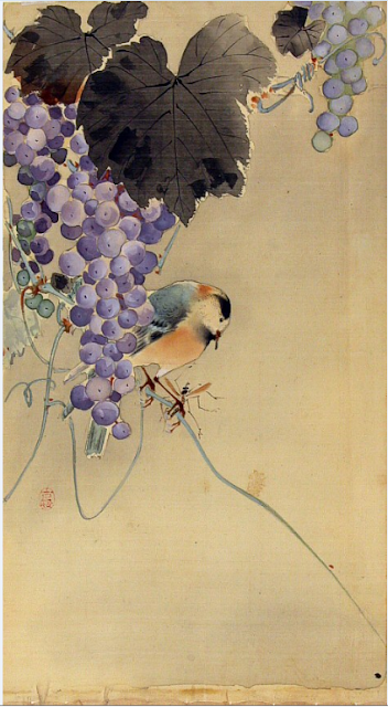
Oscar Wilde once famously said to J.M. Whistler, 'I wish that I'd said that, Jimmie,' to which Whistler replied, 'You will, Oscar, you will.' Wilde knew a good idea when he saw one, as many other artists and writers have done, (and many could improve on them). Where borrowing stops and plagiarism begins is another thing. Hiroshi Yoshida (above) just about gets away with it with his witty addition of a tent and campfire. I just cannot believe he didn't know that William Giles wasn't an avid camper. Hence the mountain campsite. William and Ada Giles presumably went to Corsica
before the first war and Giles came up with his 'venturesome' The last glow, central Corsica in 1915, some while before Yoshida would have been busy with his brush.


I suppose with Japan's unique reproductive system of making prints, anyone's work was regarded as fair game. Even so, Yoshida's borrowing is so blatant, it takes your breath away, and I can well understand why Giles became so indignant about European artists like Elizabeth Keith co-operating with Tokyo publishers. He might have had a point when it came to Charles Bartlett, who worked for Wantanabe from 1915 (Yoshida also provided designs for Wantanabe later on) and a couple of years afterwards came up with his little masterpiece, Silk merchants, India which owes quite alot to a great masterpiece - I mean, Georges Seurat's A Sunday afternoon on the island of the Grand Jatte.
                                                                      

Surprising, I know, but nevertheless true. You only need to compare the seated turbanned figures to see what I mean. But what Bartlett really nicked from Seurat was the theme and tone of the work. Bartlett, no doubt, had the excuse that colour woodcut wasn't his main work and it certainly makes you wonder about those people who pay so much for them now. But then, I also think that's printmaking for you, and in many ways adapting Seurat to an Indian setting was in itself an original thing to do.
                                                                             

Nor was he alone in making good use of Seurat. S.G. Boxsius had such a habit of using other people's work, whether prints, paintings or photographs, it really just became a part of what he did. I think partly in his case he must have learned the habit early on as the youngest brother of six. Imitation just becomes second nature, as I know, being the youngest myself.
                                                                   

You might find some of this a bit tenuous, but there is circumstantial evidence, as they say, to kind of back this up. So, I am sure that Boxsius was well-acquainted with Seurat's other masterpiece, Bathers, Asnieres when he came to make his marvellous little print, Seaside. I have talked before about a photograph of Boxsius teaching at Bolt Court surrounded by the casts of classical statuary the students had to draw. Copying was a standard part of the system, to the extent that Frank Brangwyn complained that the art schools only turned out 'clever imitators' (instead of brazen polymaths like him).
                                                                        

Even more than Bartlett, I think Boxsius made exceptional use of Seurat. Seaside is not great art, but I love it all the same, and it is fascinating to see an art teacher taking his own lessons to heart by looking hard at other artist's pictures and learning something from them. Personally, it is no surprise to me that Boxsius fell for Bathers, Asnieres. I have been gazing at it in the National Gallery in London ever since I was eighteen. Boxsius, for me, is an affordable Seurat, basically.
                                                                               

S.G.B. was also very deft when it came to Sidney Lee, but Lee himself was no slouch when it came to nicking stuff. Unaccountably, he turned Hokusai's image around, losing the crucial oban shape and sometimes even more unaccountably leaving the moon out altogether when he made his daytime versions. The moon and the separation of the main figures was the whole point of the picture, but never mind, I admire old Sidney for having a go. Hokusai's print reads from top to bottom, but Lee's lacks focus and reads all over the show.


Lee had a collection of Japanese prints and was, in fact, the first British printmaker to make such direct use of Japanese colour woodcut. Unfortunately, Lee rather spoiled it all by attempting to put himself above all that by insisting artists looked too much at the Old Masters. Perhaps Lee didn't include Hokusai amongst them. But then, Lee is easy to mock, partly because he is in some ways, an unsympathetic artist. But if he took ideas from other artists, at his best he is full of good ideas himself, and other artist recognised that. He certainly believed in himself.


I

John Hall Thorpe

$
0
0
                                                                                 

I am not going to deny that the Australian printmaker, John Hall Thorpe, hasn't received short shrift on Modern Printmakers; nor am I going to promise to make amends with this postm the first one I have given over to him. What I will say is this: he was the first of the London printmakers to understand the new commercial conditions after the first war. Whether he made the best of them is another thing. But, so far as I know, he was the first colour print artist to have a one-man show in London. And it was not just one; he had two in one year alone.
                                                               

The year was 1919. Unfortunately, I have no idea which prints he exhibited and in many ways, it hardly matters. Hall Thorpe is not the kind of artist you go to for innovation. You go to him for only one thing: lots of flowers in very simple vases. The only serious book about him offers no dates for any of his prints, but he had certainly begun to turn out his famous series of colourful flower prints by the early 1920s. Three wise men had appeared by 1919 and found him shamelessly exploiting the work of Robert Gibbings (specifically Evening at Gaza) but he had trained as a copyist at home in Sydney, where he had worked as an illustrator and staff artist on two newspapers in the 1890s, so that should come as no real surprise.
                                                                

But once he had done with variations on the work of Gibbings and E.A. Verpilleux, he set his own very successful trend with his flower studies that actually derive from the height of the Vienna Secession almost twenty years before. And very jolly they are. Hall Thorpe was the very first colour woodcut artists I ever bought, way back in the summer of 1976, when you could pick them up for very little. As I've said before, the one I had was Marigolds, but it was left with friends who became unobtainable. (And I would still like it back, Maureen, if you're reading this.) But why anyone who should want more than one Hall Thorpe, I have to admit, is beyond me. My mother, who is now very ancient, took to Sweet Peas on a birthday card I once gave her, so I shall include that rather insipid image as well. And I think this all sums up the appeal of Hall Thorpe. The prints have little intrinsic value and what you end up doing is associating them with people and places. They have that kind of bold intensity that enables you to do that.
                                                                           

Anyway, Hall Thorpe turned his studio, marooned somewhere between Earl's Court and Fulham Road, into the Hall Thorpe Studio, then opened the Hall Thorpe Gallery somewhat nearer to the West End, the real innovation being that he was the first artist to both make and publish his own colour prints. Almost everyone else depended on society exhibitions and, if they were lucky, a one-man show or, if they were more fortunate still, a permanent dealer like Colnaghi or Bromhead Cutts. Hall Thorpe dispensed with all that, and for almost twenty years was very much his own man, right until the end, in fact, when he refused any medication for the pneumonia he was suffering from (he was a Christian Scientist) and died.
                                                                              

Seventh International Printmakers Exhibition, Los Angeles Museum, 1926

$
0
0


It took a Londoner like Arthur Rigden Read to send a colour woodcut showing the old southern French city of Carcassonne to a great modern city like Los Angeles. But that was what he did when the California Society of Printmakers held their seventh international show. As Rigden Read images go, it was one his most accomplished (unfortunately the picture above was the best I could do) and I can understand why he was asking $25. Market day, Languedoc was even more at $30. By comparison, you could buy a good Seaby for $12 and John Platt's Siesta (below) for $18.
                                                                    

The image, with its detailing, use of shadow and warm colour, and dramatic perspective, shows Read considerably in debt to William Giles'Ponte Vecchio from 1908. By the time he sent his three images off to L.A., Read had only been making colour woodcuts for about four years, but was already confident enough to be asking a lot more than well-established colour woodcut artists like Seaby. For a long time, I found it difficult to understand exactly why Read was rated so highly and was always considered one of the leading British colour woodcut artists. The prices may help to explain the problem. He was prolific, and like Eric Hesketh Hubbard, he published prints with a range of prices, but his very best work rarely turns up and there is very little of it national collections. The fact that Ponte Vecchio was a better and more ground-breaking piece of work with its use of bravura perspective of the kind that Read used in his print, is perhaps beside the point. Carcassonne remains a very nice print, and one I would like to possess.
                                                                                       

To my frustration, I have always been unable to find an image of Seaby's print Redwings Calling (or, at least, what I believe is the print by that name). I shall have to content myself with Shetland Ponies, which he also showed at the exhibition, but which I think has a lot less about it. Redwings Calling is Seaby at his most daring and poetic whereas I actually sold Shetland Ponies to a friend many years ago (mainly because it was laid down). But again, just like Read, his own selection showed Seaby showing both more conventional and more original work. Personally, I much prefer Seaby's birds to anything else he did, but I'm aware that not everyone would share my taste.
                                                              

You will notice I am limiting myself to British colour woodcut for this first look at the exhibition. After the Americans, the British showed the largest number of prints. This shows by how much the colour woodcut scene had taken off, with artists like Read, Kenneth Broad (below) and Eric Slater (above) all showing work that was part of the great revival of interest in colour woodcut at the time. I think this is the right Sussex windmill by Slater. In some respects, it hardly matters; many of Slater's landscapes are very little more than designs, with little sense of place, light, interest, or anything else.
                                                        

Kenneth Broad's subtle A Sussex Farm is another matter altogether. It comes from the short period in the mid 1920s when Broad's colour woodcuts were at their very best and I am surprised he didn't send more work like his masterly New Fair, Mitcham to California. The taste for landscape, I suppose, was something both the British and the Americans had in common and it certainly strikes me that the British were presenting a rather restricted image of themselves.
                                                                      

Apart from Mabel Royds, that is, who by 1926 was embarked on her great project of turning her Indian sketch books into colour woodcut. As her Lamas Harvest (above) dates from 1924 and is the only thing that seems to fit the bill 'Musicians' which was the tile used in L.A., this is the one I'm going to use. It's a fine and original conception of people working through the rhythms of the agricultural year with actual music to accompany them. There were other women artists exhibiting, but it hs been impossible to turn up any other images by them that were on show apart from Frances Blair's Cornish Cream Shop, which of course  I have used before. Even the three Helen Stevenson prints have defeated me. But that just goes to show you all that there are still plenty of discoveries to be made.
                                                      

S.G. Boxsius 'In old Whitby'

$
0
0


In many ways, In old Whitby is a colour woodcut in search of a subject. It is nowhere near a duff as the last print by Boxsius that I featured, but it is some way short of Boxsius  at his beautiful best nevertheless, and I ask myself why.

I sometimes wonder why it was that Boxsius failed to exhibit prints until the early thirties when he knew enough about linocut to write an article about making them in the mid twenties. It may well be that although he signed prints like this, he was still not entirely happy with them for one reason or another. His stone steps and wooden rails leading down to the water are more of an exercise than a subject. He manfully distinguishes between the grey stonework and the maroon shadows and orange rooftops, but all the same one wonders why he bothered. It's not that he wasn't intelligent or able.
                                                                          
Part of the answer I suspect can be found in a print by William Giles called At eventide. Rothenburg am Tauber which Giles came up with about 1905. Now, the article on linocut I mentioned was written for Giles and in my mind there isn't much doubt that Boxsius learned his woodcut trade from Giles, but where Giles succeeded in At eventide with masterful insouciance, Boxsius comes unstuck, and where Giles transforms his wonky white rails and twisting tree trunks into runic sentences, SGB is literal.

                                                                                     
Boxsius was clearly searching for something of his own here because he attempted this same subject of harbour slipways and steps more successfully in some of his Cornwall prints. Apart from the imaginative independence of Giles, Boxsius also lacked his training. Almost all British artists who went through the State system were trained as teachers. The only fine art course on offer was at the Royal College if  you got on. So far as I am aware Boxsius trained (and taught) exclusively within the State system whereas Giles also studied painting in France. I have no idea about the courses either of them took at the Royal College, but what I am suggesting is that what many artists in the early C20th lacked was formal training as painters. If you add to that the strong influence of the arts and crafts movement which by and large rubbished any distinction between fine art and craft, I think you can see why printmakers as various as Kenneth Broad, Allen Seaby, Sidney Lee and Boxsius often turned to other artists for ideas. As we saw in the post before last, a good look at Seurat transformed Charles Bartlett's rather subectless Indian images into something more spectacular.

Finally, readers now tend to comment when Boxsius images that are new to them turn up on Modern Printmakers. This is because some of the images have only just found their way onto the web. This latest is a good find by William P Carl Fine Prints where it is now for sale at $550. My thanks are due to them.

Christmas with George Scott Ingles

$
0
0
                                                                                

Here is an artist who is usually passed over when it comes to his colour woodcuts, mainly because he appeared to make very few of them. He came from Roxburgh in Scotland but spent his working life as a teacher, largely at Leicester School of Art where he eventually became principal. He was an early graduate of the newly formed Royal College in London in 1900.

It was at Leicester that he must have got to know John Platt who was principal himself between 1923 and 1930. The church tower has some of the Platt traits, including a sophisticated use of colour and overlapping planes. It is in fact remarkably modern looking for 1927 and shows just how early the 1930s really began. On the face of it, it also has all the tell-tale signs of the arts and crafts with its depiction of the kind of a sturdy church beloved of so many unbelieving artists. Looking at it, I did think it was a modern arts and crafts church, but I was wrong. The church of St Leonard at Bulford in Wiltshire is one of the oldest in the country (and one of the few to be owned by the Ministry of Defence).
                                                                                  

I assume it also has a personal connection with Ingles, because a Canadian cleric called George Leycester Ingles was buried there during the first war after dying of disease, so the print acts as a momento to him, something so far rare in the jazzed-up world of colour woodcut. It perhaps also helps explain the peculiar dignity and restraint of the image. You will notice that Ingles nevertheless altered the proportions of the tower, which did have a cock on top of it at some point after the photograph was taken. By the time Ingles came to make his print, the cock had disappeared, leaving only the metal support behind.

Interesting too the way he decided to make use of the ivy-clad farm elms around the church, which you can see growing all around the village like weeds. Kenneth Broad, a great one for trees, picked up the same kinds of elms growing around his Sussex farmhouse. (The ancient hybrids were closely linked with habitation). Ingles didn't start making colour woodcuts until he was in his early fifties and sad to say I've only comes across three titles, all exhibited between 1927 and 1930, so if anyone out there has more, please let me know. This is the only one I have ever seen

Anyway, this is a long-winded way of wishing all readers of  Modern Printmakers a very Happy Christmas and prosperous New Year. I will be posting until then, but after that it will be the Koutoubia at Marrakech rather than the snowy wastes of central England for me.

The paintings of Ohara Koson

$
0
0


The role that was played by scholars and collectors like Ernest Fennellosa and Edward Morse in the revival of colour woodcut is a fascinating one. In my own view, the revival would not have happened without then, but that is another thing. Fennellosa had taught for a number of years in Japan before he returned to Boston to take up a post as curator at the Museum of Fine Art. About 1890 he met the young artist, Arthur Wesley Dow, and then introduced him to the German printmaker and scholar S.R. Koehler who had posts at both Boston and at the Smithsonian Institution in Washington, and it was not long before Dow was making the first American colour woodcuts in the Japanese manner, which had their first exhibition in a corridor at M.F.A.
                                                                        

Then in 1895, Fennellosa was dismissed from M.F.A. following his re-marriage. (The authorities believed it came too soon after his divorce). Back in Japan, Fennellosa met another young artist called Ohara Koson who he engouraged to make colour woodcuts that would appeal to the western market (and so, presumably help with the revival). Thus began Koson's long career working with at least three different publishers who sold his work widely in the United States and Europe, a publishing campaign that was so successful it is still possible to pick up Koson prints in British antiques centres for a nominal £10 simply because people cannot recognise Japanese signatures.
                                                                                     

The collections of people like Morse and co-enthusiast, William Bigelow, were very large indeed, and eventually formed the basis of entire collections at museums like M.F.A. But these men were also scholars who were principally concerned with recording and conserving the artefacts of Japanese culture. They travelled the country for years, not only acquiring ceramics and picture, but recording archaeological sites, just as aware of the effect of modern life on the arts and crafts in Japan as the followers of William Morris were in relation to British culture.
                                              
 
What I had certainly not come across in any British junk shops were paintings by Koson of the kind you see here. I am indebted to a collector in Washington, D.C. for these. In itself, his own collection, which is destined for the Smithsonian, shows that the tradition of scholarly collecting of Japanese art is still alive and kicking in the States. Frankly, it seems astonishing to me that anyone is still able to acquire so much material like this, but then the assiduousness and erudition of good collectors should never be underestimated.
                                           

Put in this context, the production of colour woodcuts in the west looks almost like a by-product, except perhaps in Koson's case where the production of his prints was so vast you can still pick the odd one up as you as you go along. I still remember finding two in a heap of disregarded papers after a friend had died. Much of Koson's earlier work was painted on fine silk, as you can see here, though he later used paper. The silk sometimes remained unpainted so that the final effect of some of the prints at least is that much more subdued because the backgrounds were printed in grey. But even with the crow, where Koson painted the background (or the lack of it), the blacks and greys are enhanced in printing and the final effect sharper and dramatic.
                                                                                 
                                                  
What also strikes me is the different appeal of painting and woodcut. There is the effect of scale. The paintings were generally postcard size while the woodblocks were considerably larger. The two swallow images are to scale but not actual size, and do give some idea of the wide-screen effect of the woodblocks. Either way, the limited use of colour is consistent and striking. Not that this semi-monochrome approach was unique to Japan; it is widespread though less obvious in western art. The paintings have a subtle delicacy the prints forgo, but the prints gain in drama and clarity that is the essence of good graphic art anywhere.
                                                                                              

Essentially, I wanted the work to speak for itself. What I do want to express is my considerable gratitude to Darrel Karl, not just for the loans of all these images, but for his painstaking correspondence about Koson (and other artists). Please make sure to read any comments by him as they will add considerably to the little I have been able to say here.


Modern Printmakers update

$
0
0
                                                                              
 
No doubt people are wondering what has happened to Modern Printmakers. The blog has been inactive for a while due to various reasons. Nevertheless, I still check the comments section and reply.

Hopefully, there will be occasional posts starting again very shortly. In the mean time here is one of Allen Seaby's wonderful kingfishers, currently on British ebay with an unnecessarily high starting bid

What makes a winner? Colour prints at Los Angeles

$
0
0
 

I am probably not doing myself any favours with a post like this but here goes, anyway. At the end of the first war, the Society of California Printmakers held their first annual international exhibition at Los Angeles. This soon excited interest in Britain, interest which only grew when the British began to do very well for themselves. For instance, John Platt received the gold medal for best overall print with his exemplary colour woodcut, The giant stride, at the third exhibition in 1922, success that finally led to the Canadian, Walter Phillips, saying in 1927, 'As usual British artists take the awards at this exhibition.' How did this come about? And were those winning British prints really better than their rivals' work?


I think the answer has to be yes. From the very start, the British had concentrated on skill and although it was a cleverness that Claude Flight sneered at, the committee at Los Angeles was clearly impressed by the level of technical skill displayed by the British artists.  It was more than a matter of colour and expression. Platt had received a wide training, not only in the arts and crafts but to a lesser extent as an engineer and architect and all this showed up well in The Giant Stride. He was also canny (or fortunate) in his choice of subject. Giant strides had first become popular in the United States and the whole bravura episode on the beach must have had great appeal to Californians.


I don't know which other colour prints Platt was competing against in 1922 but by the time Arthur Rigden Read exhibited Carcassonne in 1926, he had two of the most illustrious of modern colour woodcut artists to contend with. Nevertheless, he came away with the gold and Gustave Baumann had to be content with the Storrow prize for best block print. Summer Clouds is a blissful evocation of art colony life in New Mexico but would have been no match for the imaginative and dynamic portraiture of John Platt. Now compare the simple life of hollyhocks and pueblo-living in the desert with Read's complex understanding of architecture and perspective. Yes, it was a self-conscious, prize winning piece, but it also had a history that helped it on its way and would not have been possible for Read to make without the great example of William Giles'Ponte Vecchio from 1908. It didn't matter whether it was Giles, Utamaro or Italian chiaraoscuro colour woodcuts, Read had a keen eye and knew a good thing when he saw one. The British had been trained to use the best examples from other cultures and from the past. It would have been as easy for Read to have taken the old walls of Winchelsea (where he was living by that time) as it was for Baumann to depict the pueblos at Santa Fe, but Read could do what Giles could also do; as the French critic Gabriel Mourey put it about Giles, Read could transpose his feelings and exalt and with Carcassonne that was what he did, and with more effect than Baumann.


Nor was Walter Phillips'Wylye Mill Bridge (1925) really in with a chance, for all its exquisite sensibility. Phillips liked to present himself as a pioneer and emphasised that he had never seen a Japanese colour woodcut when he made his first prints about 1916 and that he had approached colour woodcut with resourcefulness and determination like some logger in the wilderness. But Read had only begun to make colour woodcuts in 1922 yet only four years later, he was able to take a leading prize. So, how did that happen? I think it was because he was already steeped in printmaking and had been looking at Japanese ukiyo-e prints and other forms of printmaking since he was in his twenties. The kind of semi-abstraction made use of by both Baumann and Phillips had no appeal for Read. Read had a versatility when it came to both technique and subject matter that the Americans could only dream of. It was versatility based firmly on observation, both of life around him and the work of other artists, including Americans like John Singer Sargent.


Ironically, Phillips subject for the 1926 was a British one. Another artist to visit Britain was Ernest Watson who was awarded bronze for his linocut, Misty morning. In its own more conventional way, this is a fine piece and almost certainly doesn't come across as well on a pc screen as it would do in front of you. What it lacks in originality, it makes up for with overstatement. It is the most obviously period of all the five prints here and yet again has a strong abstract feel to it. Compare Allen Seaby's The trout which won the Storrow the following year. Seaby combined style with observation and original technique. For all his borrowings from Hokusai, he broke with convention as wholeheartedly as Read.


But the real irony rests on where this leaves us all now. You can try and find a Baumann or a Phillips for the same price as a Read or a Seaby today, but you will not succeed - not on the open market, at least. Of all these artists, Read is the most difficult to come by, despite the fact that his reputation was high in the twenties and thirties and people (and I include myself here) just do not see enough of his work to make an adequate judgement of what he could do. Seaby admired Phillips and owned three of his prints but they would now all cost a lot more than anything by Seaby. Does that mean that Read, Platt and Seaby were overvalued by American judges in the 1920s? Or does it mean that American and Canadian colour woodcut artists are over-priced today?

I think you know the answer.


Charles Paine & stained glass

$
0
0
 

I would like to say that I have here an example of the work in stained glass by the British designer Charles Paine. Unfortunately, this fetching little bird is the work of John Platt (at All Saints, Leek) who was Head of Applied Art at Edinburgh when Paine was working there. There has been correspondences for some while now on my last post about the design work of Paine and it is typical of our ludicrous age that I have been unable to find any of Paine's stained glass to illustrate this post. Almost all you get is posters, ironic because I believe it was stained glass that he excelled in.

It is easy to forget how much colour woodcuts were seen as part of the Arts & Crafts movement at the time, but not only was John Platt involved in stained glass design before the first war (he learned the technique at the Royal College), Frank Morley Fletcher who was Director at Edinburgh was also a maker of stained glass and certainly worked with his students at Reading on a window there about 1905. Like Platt, Paine also attended the RCA, though a little later, and in the 1920s went to work as head of applied art under Fletcher at Santa Barbara. All of which tends to suggest to me that there is an unwritten story here that I do not have the time to research. Stained glass isn't fashionable in the way that posters and prints are, a shame if one only considers the vivacity and grace of Platt's work here.

Needless to say, if any reader knows of the whereabouts of any of Paine's work in stained glass, they should let me know and it might lead us somewhere.

Julia Mavrogordato revisited

$
0
0
                                                                                   

Time was there was so little work by Julia Mavrogordato available online, it was hard to tell what kind of an artist she was or even how many linocuts she had made. This situation wasn't really helped by people such as myself posting bird images from the menu cards she made for the Orient shipping line in the 1930s. They are interesting, of course, but are no more than machine-printed designs.


Since then things have improved, though not that much. One or two more linocuts have appeared, the odd oil or watercolour and, yes, yet more menu card designs, which continue to skew the picture we have of her. But then what do we know? Unless you are a rather smug curator in Christchurch, New Zealand, sitting on a file of material, including information you've had from mere bloggers, there isn't a lot to say. She was a member of the United Kingdom branch of an old Ottoman Greek family, was educated at St Hilda's College, Oxford, and was good enough at linocut to be asked to exhibit with the British linocut exhibitions organised by Claude Flight. So, it isn't much.


As you see from Summer sailing (top) like most other British linocutters (but not all) she printed by hand using printer's ink. This was how she achieved the uneven, atmospheric printing that were so typical of linocut in the twenties and thirties and that we all like so much. It also accounts for the famous smudged margins that we now associate especially with Claude Flight's students at the Grosvenor School. But the images we have are not quite so standard. I think all the ones I know depict animals or birds and also that, one way or another, that show the kind of pursuits that were popular with wealthy people.


There is sailing, hunting, show-jumping, but there is also something more, not so much a sense of privilege as a directness and an earthiness and directness that suggests life. We can also see the way she handles light. The thin, wintry light of Gone to ground (third from top) is quite different from the bouncing reflected light of Summer sailing and much as I like Sybil Andrew's linocuts of rural life, Mavrogordato has something special. The hounds plunging into the bracken and swimming through it have more life in them than the pattern-making of the Grosvenor School would allow for. She was an intuitive but an educated one.


The textures she achieves, the distinctive scratchings and criss-crossing of the surface of the lino doesn't really come across that well on the menu cards but even on a computer image, the variety of tones she achieved with limited colours is obvious, and the impact of her shapes and the fluidity is really quite remarkable. What I am saying is we need to see her as an artist working in linocut (and using it exceptionally well for all her primitive feeling) and not simply as another stylised linocut artist. Otherwise we miss the point of those excited, snuffling hounds and searching spotlights.

Allen Seaby 'Art & Nature' at Reading Museum

$
0
0
                                                                         

To add to the list of early C20th British colour print artists with new exhibitions and books, we now have the most deserving so far. Following Sydney Lee, Eric Slater and Leonard Beaumont, an exhibition of Seaby's work opens at Reading Museum on 11th October, 2014, and runs until 22nd March, 2015. So, you have ample warning and plenty of time to go.

This is far from being his first solo exhibition at Reading (where he taught for many years) but I am not going to give away details here. The museum hold a good collection of Seaby's colour woodcuts and gouaches and no one should assume that only colour prints will go on show. It will be very interesting to see what they do exhibit. Seaby was an indifferent painter; not only that, his colour woodcuts over a very long career were uneven and not everything was as sublime as Heron, a print made when I think he was at his best around 1905 to 1910. But I don't want to prejudge a show, which most people with a serious interest in colour woodcut will want to see.


As part of this concerted push on Seaby , there is a book, to be published in mid October (the publication is delayed) and written by Martin Andrews with the help of Seaby's grandson, the linocut artist, Robert Gillmor. I've not had my copy yet but Andrews did a meticulous job on Robert Gibbings some years ago and I know that Robert Gillmor has long wanted his grandfather's work to gain the recognition it deserves.  I will be posting a review just as soon as I've read it. In the mean time, if you can't wait, you can buy a copy online from Two Rivers Press at £12.99 plus postage. It has 76 pages, they will send it anywhere and they aren't expensive, but you will need a PayPal account to buy it from their website.

Take my advice and buy your Seabys now. You certainty won't be able to afford him after all this.

Hans Neumann & Otto's legacy

$
0
0
                                                                                   

The Otto of the title is Otto Eckmann, the German painter who sold off all his paintings in 1894 and worked solely as an applied artist after that. It was a radical move true to a radical era. By the following year he was contributing graphic work to the brand-new Berlin periodical Pan. (The first edition had an advert for Samuel Bing's L'Art Nouveau exhibition in Paris.) He then began working for the Munich periodical Jugend when that opened in 1896.
                                                                                  

Neumann was the son of the artist and teacher, Emil Neumann, and while his brother, Ernst, had gone down to Munich to study at the Academy, Hans had remained in Berlin to study under his father. It was by way of Ernest that he came to know Eckmann. Although Pan had used both etching and lithography as well as some colour woodcut to illustrate the magazine, Eckmann encouraged both brothers to make use of woodcut. 'Concentrate on woodcuts,' he told Hans in 1901. 'The woodcut technique... is forcing you to concentrate on the essentials.' (Die Technik des Holzschnittes zwingt Dich unweigerlich dazu, Deinen stilistischen Ausdruck auf das Wesentlichste zu konzentrieren.)  It was good advice. Eckmann could see that Neumann was simplifying the technique in a modern radical way. Eckmann took a broad approach but made heavier use of Japanese art, including the keyblock used by the ukiyo-e printmakers. From the start, Neumann used the keyblock with caution and very often not at all, as you can see from his borzoi.
                                                                                   

But perhaps there was also more to Neumann's Wesentlichste than only woodcut. I think there was a greater crossover between modern creative lithography, with its use of texture and bold shape, and innovation in modern woodcut. At least one of Neumann's early prints is described as a litho-woodcut (and I'm not sure what that means) while Sonnenschein  is as casual as a photograph. Neumann was looking beyond Japanese colour woodcut at other techniques being used around him. What was attractive about woodcut was the simple fact that he could print them himself and did not have to rely on a printer or his press. It helps explain his early use of that commonplace of German printmaking, hand druck. It is the dullness of the red and the stippled printing of the second borzoi that gives the game away. It may be as abrupt and selective as a Japanese print but it is modern in a way that almost no woodcuts using the Japanese method ever are.
                                                                                              

Neumann was not a purist; unlike Carl Thiemann, there is never any great sense of the medium being used and when he does occasionally go in for conventional cutting, as he did in Canale Grande, it looks like a Thiemann. A later print like Neuschnee is unmistakeably a woodcut but I wouldn't say it was altogether typical. Also, unlike a lot of the prints he made, Neumann didn't make use of a watercolour medium to print with. He obtained the greater clarity you see here by using printer's ink. (I know that because I am fortunate enough to own this print).
                                                                                             
                                                                                       
So, did Eckmann really have a legacy as Neumann said he did, what he called Ottos Verkaempftnis. Well, if you look at the way Neumann handles the meandering shapes made by the larger pine trees or compare Eckmann's crab from Jugend with Neumann's Rabe im Landeanflug, I think the answer is, yes, he did. The point is Eckmann died from tuberculosis the year after he gave his fellow-artist the advice, so it perhaps gave the remarks greater valedictory force.
                                                                                  

What we also have to remember is just how early some of these images are compared to many modern colour woodcuts and yet they appear contemporary with artists like Thiemann or Hans Frank who in fact were working later. The real legacy lies here; there was a decisiveness about Eckmann, he was ill but got on with things, and he gave Neumann a simplified, directional force that comes across the first time you see his work. I was lucky to see some of his best prints first, prints which are still not available online (and I have tried scanning them but it weakens them and it would be wrong to do Neumann such an injustice).
                                                                              

I could say more (and probably will). It can take hours to uncover new images hidden in little corners of the net. Nor do I think the scope of the images that are easily available online always do Neumann the justice he deserves. The delicacy he achieved, especially in his later work, is not always something a pc monitor screen is good at. Beyond that, his sense of scale is also missing. Nothing beats seeing the print in front of you, particularly with an artist like Neumann who relies so much on tone, and Eckmann's advice to you would be, 'Buy them when you can.'

Allen W Seaby, Art and Nature: Martin Andrews & Robert Gillmor

$
0
0


Anyone who sets out to produce a small book about the British artist, author and educationalist, Allen Seaby, will be faced with a large predicament: what to make of it all, the bird illustrations, the pony stories, the colour woodcuts, the art history, the ornithology, the animal carvings? He died in 1953 but was essentially a late Victorian, erudite, thorough, encyclopaedic and are any of us a match for that?
                                                                              
 
Martin Andrews and Robert Gillmor have sensibly shared the task. This was the option taken for recent books about Lucien Pissarro (2011) and Walter Phillips (2013). The specialist can deal with history and technique while a descendant of the artist can write a memoir and appreciation, as happened with Phillips. In Robert Gillmor, Seaby is fortunate enough to have a grandson who is also a distinguished linocut artist and writer and who has already given talks about the life and work of his grandfather. The task of writing about British colour woodcut given to Martin Andrews was in many ways far more complex. The history of the subject, and the part that Seaby played in it, has not so far been written and nor, as it turns out, was this the occasion to do so.
                                                                            

There is a good deal to admire here. The first part of the book takes the scrap-book approach, giving a strong flavour of the varied life that Seaby led and the final section takes an all-round approach to Seaby's work as an artist. To readers of this blog, much of this will be new. Illustrations from his sketch-books are very rewarding. Personally, I would have liked to have seen more of them and fewer of the later work on linen. The watercolour sketches takes us back to the days of John Ruskin, William Holman Hunt and Edward Lear, with Seaby himself achieving the balance of description and form his work is noted for. Unfortunately, the key document that shows just how he developed his approach is missing from the book. It is certainly all helped by the high standard of reproduction and the scanned images you see here are unworthy of the book but the best I could do.
                                                                          

This is not a book about Seaby's colour prints and producing a scholarly catalogue, useful as it would be, would have been a long and very difficult task. High standards have recently set by James Trollope for Eric Slater (2012), Timothy Dickson for Leonard Beaumont (2013) and most remarkably Robert Meyrick for Sydney Lee (2013). Seaby produced more prints than any of them, around 100 full-size colour woodcuts over his long career, many without titles, and none that I can think of with dates. Yet a check-list for many of his woodcuts, with titles and dates, has been in existence for many years (and I have a copy) and what mars this book are the mistakes with both dates and titles that could have been avoided. Unaccountably, the authors also give descriptive ie invented titles without placing them in brackets to make clear the titles are unknown. So, Twins (1936) becomes 'Goats and kids' early 1930s, Tutankhamen's burial place (1925)  becomes 'Valley of the Kings' Egypt, early 1920s, Rotherfield Mill, Sussex (1935) is relocated to Brill in Oxfordshire during the 1940s, and what must be Black, white and grey (1936), showing a hutchful of rabbits, becomes the delightful 'Happy family'!
                                                                                 

I could go on but should now deal with the tricky topic of early colour woodcut in Britain. No one should approach this minefield without considerable preparation and absolute caution. Robert Meyrick did a concise and informed job as part of his essay on Sydney Lee (and there was perhaps only one mistake) and James Trollope, not being a specialist, wisely left his remarks about colour woodcut to the final section. What made Martin Andrews attempt the write a five page summary of  'The colour woodcut movement' and where did the material come from? There are no notes, and I wonder how any of this will strike readers new to the subject. 'Artist and teacher' and 'The colour woodcut movement' are riddled with errors and what I can only take to be assumptions.

It would be easy (and unkind) to go through everything, but I was bemused to learn for instance that John Dickson Batten was studying at Reading School of Art  in 1876 (and perhaps he was) when he was still at Amersham Hall School, but then the notes are lacking. But the worst is reserved for Walter Crane who is made to give up an important post as principal of the Royal College of Art to take up a part-time position as director of an art department at a provincial extension college of Christchurch, Oxford. Crane left Reading for the Royal College when it was set up in 1898 and, frankly, it would have been sensible to have left Reading and the Royal College well alone. Suffice to say, more research was needed, or a lighter touch. It wouldn't have broken the bank if the history had been left to another day. Or to someone else.

Allen W Seaby, art and nature is published by Two Rivers Press at £12.99 and is available directly from them.


Hans Neumann's 'Neuschnee'

$
0
0
                                                                       

I've heard today from a reader in Germany who recently bought a proof of Hans Neumann's woodcut Neuschnee. It differs quite a lot from the one I used to illustrate the recent post on Neumann's work. To start with, unlike my own, it is signed (but then mine has a strange fine scratch on it). More importantly, it is inscribed sonderdruck. I think this means it is from a fine edition and was printed using a water-based medium rather than printer's ink. As you can see, the tone is different and my reader says the blue is stronger than in the photograph he sent.
                                                                       

You will also notice that the paper is wrinkled (below) where the block was printed and that it is cockled at the top. Generally, this suggests a woodcut has been printed on japan although I have seen nothing more of my reader's print than you have. Mine is on a stiffer, laid paper which is pale beige. I also need to say the second image does have a keyblock border but it was missed off the image I found. You will also see that in close-up the finer image is stippled while the brown image is not. I would certainly think the change of colour is intentional. It makes the difference between the two images obvious and would possibly encourage collectors to buy both. I know that given the chance, I would.


Many thanks to Markus in Germany for sending in the image. I suspected there was something odd about this print and know we all know.


Edna Boies Hopkins

$
0
0


I never appreciated just how good Edna Boies Hopkins was until the postman handed over a book about her this morning. It says a lot about the kind of images we see online to start with and the way they don't always do an artist' work justice. An exception would be the old post on 'Japonisme' but in Dominique Vasseur's book, print after print holds its own, and it was worth every penny, nickel and cent.
                                                                                     

She is one of the few artists I find hard to decide which images to choose (when I have a choice). She was not just prolific, she was consistent. I may not like everything she did quite as much but nothing gets the thumbs down, which is saying quite a lot.


But here is what they call a personal selection. It's heavy on the famous flower prints but those are the ones I like most. From the more obvious Japanese imbued ones of her early years to the art deco images of the twenties, I think they are all like her, terrific.


Less was obviously more with Hopkins. What she was doing was essentially simple but done with great style and imagination. She was one of the generation of American artists who spent a lot of time in Paris as well as training with Arthur Wesley Dow and in Japan and it's that wealth of backgrounds that show up so well in all the prints here. She is full of nuance, like a spring day.


She spent ten years in Paris between 1904 and 1914 then with war looking imminent, he got a job teaching in Cincinnati and they moved back home. But Cincinatti didn't hold her and independent woman that she was, she taught in New York and set up with printmakers like Blanche Lazell in Provincetown and from 1915 began to use what's been called the white-line method.


I'm not going to go into details, partly because it doesn't appeal to me so much and partly because I just think it gave many of the prints a fake modernity and for Boies Hopkins something was lost in the mix. B.J.O. Nordfeldt was one of the artists to take this method to its logical extreme but I'm not convinced by a lot of his work anyway. But Boies Hopkins is another matter.

Eric Slater's ebay

$
0
0
                                                   

Following the recent  sale of Eric Slater's well-known  The coastguard station (below) for £720, we now have A Sussex Mill (above) with a starting-bid of £250 from the same seller. Time was (and it was not so long ago) Slaters sold for £250. Not any more. Readers with an interest in Slater will have noticed that some prints have fetched a lot more - if I remember rightly one went not so long ago for around £1200.
                                                                              

The print on offer varies quite a lot from the version in James Trollope's book, Slater's Sussex. Generally, I think it's livelier and presumably Slater felt the same way about it. The blues are brighter and there is more green so the contrasts are greater but that only increases the colour-by-numbers effect that Slater undoubtedly has. They have period charm, yes. Are they worth £750? Most certainly not. Why are people prepared to pay so much? I really have no idea.

The prints certainly appear to be in good condition and how many are left to come out on the market is anybody's guess. The woodcuts with an edition given in the book are in 50s and so it surprises me they keep on turning up. I also wonder what will happen if something rare is being held back in reserve because I am quite certain that a market is being created here for those who seem willing to pay.
Viewing all 255 articles
Browse latest View live